Articles by: Merrill Cook

Benchmarking: Diffbot Knowledge Graph Versus Google Knowledge Graph

Knowledge graphs play a role in many of our favorite products. They provide information and context that serves up recommendations and additional information just where we need it.

They’re how Alexa and Google search can provide information on entities related to a request. They’re how Netflix builds a profile of the genres, plots, and actors you like.

Many knowledge graphs that reach consumers are primarily built on internal data stores. But a growing number also augment their breadth and timeliness by sourcing information from the public internet

Three North American entities have claims to crawling the whole web in order to structure information into knowledge graphs. These organizations are Google, Bing, and Diffbot. 

All three provide some level of knowledge graph access to end consumers. Though –of these three – Diffbot is the only commercial knowledge graph provider that allows data teams to integrate and download the entirety of their data. This makes Diffbot’s Knowledge Graph a great starting point for machine learning projects, deeper market intelligence exercises, or web-wide news monitoring projects. 

With that said, many product leaders and data teams are not looking for the widest coverage or the largest sets of ingestible data, per se. Rather, these teams are discerning which knowledge graph has the coverage they need.

For example, do you need rapidly updated information about large entities that are easy to track? Do you need suitable coverage of extremely long tail organizations? And what types of data do you need? Basic organizational data? Articles about specific entities? Product data? Discussions or events? 

In this guide we’ll work through a comparison of data coverage between Diffbot and Google knowledge graphs, both of which are available through knowledge graph search APIs. 

Note: Before we jump in, one thing worth noting is that the Google knowledge graph API is not recommended for production uses, rather it’s more of a demo of their internal technology and data. 

Check out our comparison of data returned from Google and Diffbot KG search APIs here

Which Knowledge Graph is Larger? Google VS. Diffbot

Historically, knowledge graphs used in academic settings have been too small for viable commercial use. But once knowledge graphs grew substantially past this size, the absolute size of a knowledge graph often wasn’t a proxy for the usefulness of a knowledge graph. 

To show you what we mean, both the Diffbot and Google knowledge graphs hold roughly the same number of entities: ~5B (Google, 2020), and ~5.9B (Diffbot, 2022). But knowledge graphs are built around “things” (items in the world), and ~5B doesn’t begin to account for all of those.

So what “things” are included? Industry insights? Global news coverage? Can this data tell you whether you’d like a movie or should buy a product?

All of these are viable uses for knowledge graphs, and the answers are dependent on the following non-scale related features:

  • What type (topics and fact types) of data is included
  • How up-to-date data is
  • The number of valuable fields per entity
  • How accurate data is
  • How easy it is to extract the data you need
  • How easy it is to fit this data into your workflows
  • And business process-related aspects like pricing, uptime, data provenance, and so forth

To dive into the differences between Diffbot and Google knowledge graphs on the above points, we’ll need to provide some background information about how these knowledge graphs are constructed. Following this, we’ll jump into an up-to-date benchmarking of the coverage of specific entities within each knowledge graph. 

How Google Crawls the Web

Historically, Google has crawled the web to surface what it deems to be the most useful pieces of content around search keywords. Sites deemed more useful or “important” get crawled more frequently. And the top sites tend to present highly in many search terms related to their offerings. 

While Google applies robust natural language processing to pages in order to provide their search service, many surfaced “facts” are not integrated with their knowledge graph as seen in knowledge panels or their KG search API. Take for example the knowledge panel result for Diffbot.

The entry to the right typifies an organization “knowledge panel” within Google search

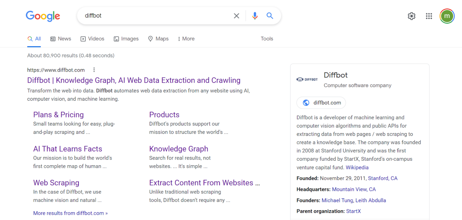
The area to the right in the screenshot above is the Google knowledge graph-derived knowledge panel. Facts included in these panels are typical of linked data, wherein the organization entity of Diffbot is attached to other knowledge graph entities including locations, people, and other organizations. 

Search results (content) are used to expand knowledge panel offerings

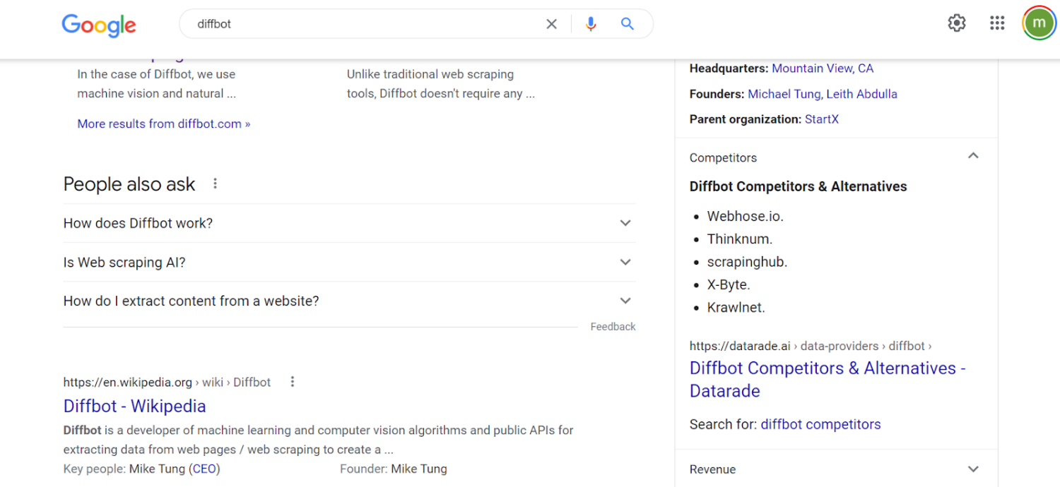
Furthermore, the result is enhanced by additional content. If we click through to competitors, Google can serve up and highlight a portion of content that claims to be about competitors. But even though Webhose, Thinknum, Scrapinghub and others listed all have their own knowledge graph entries, this data isn’t linked. The NLP by which Google is parsing content to categorize and serve up this article on competitors is not integrated into the Google knowledge graph. Clicking through to the headline about competitors does not lead to knowledge panel-related data. But rather takes you to an article that is the top ranking result of the search “Diffbot competitors.” 

Recommendations (“People also search”) are facilitated by knowledge graph linkages

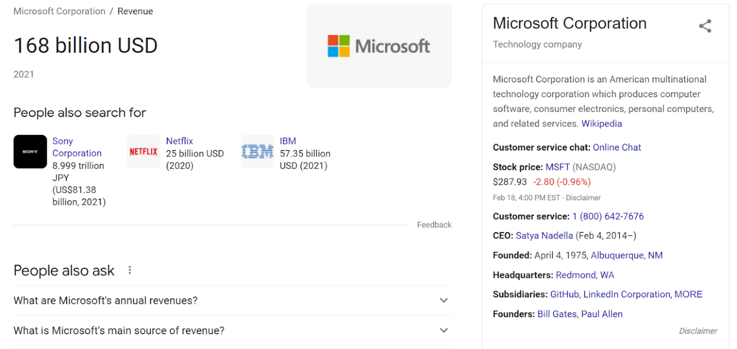
Let’s take another example, wherein we look at a publicly traded company. Searching “Microsoft Revenue” returns the Microsoft knowledge panel as well as the most recent publicly listed revenue number. A great number of fields displayed here are from the Google knowledge graph API. But clicking through to the disclaimer below financial data takes us to Google Finance, a separate service from Google’s knowledge graph. Linked data is present in the “people also search for” section. And each of these organizations does have their own knowledge panel result. But at the end of the day, clicking through any of these simply routes users to a suggested search. 

Related products are held in the knowledge graph, but data is provided by Google Shopping

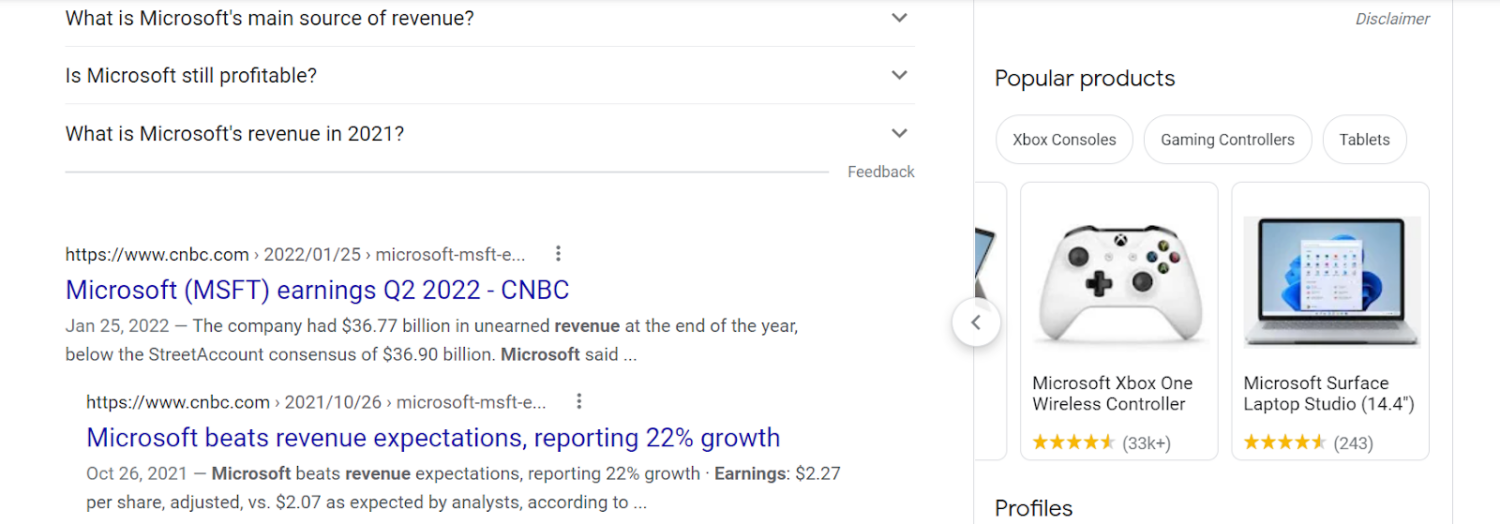
Dropping to the bottom of the knowledge panel for Microsoft, yet again we see the appearance of linked data. In this case products that are related to Microsoft. But clicking through to each simply returns search results (albeit aggregated values related to price, availability, and reviews). We can verify that this product data is not in fact part of Google knowledge graph by searching for a “Microsoft Xbox One Wireless Controller” using the knowledge graph search API.

There is no “XBOX One Wireless Controller” (from the prior image) in the Google Knowledge Graph

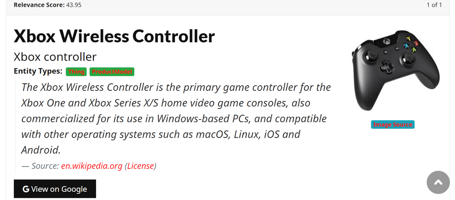
Above is the result for a Google knowledge graph API search for a particular model of XBOX controller (an XBOX One controller) that is served up within the knowledge panel results. What is returned is a general category of “XBOX controller” sourced from Wikipedia, with entity types of “thing” and “productModel.” The closest entity to what was served within the knowledge panel as actually a somewhat generic category of products. The “XBOX One Controller” from the knowledge panel actually isn’t from the Google knowledge graph. 

All this hints at the fact that Google pads out the appearance of their knowledge graph in it’s most prevalent form (knowledge panel results) while not actually ingesting and linking many of these additional data structures. 

Sure, Google crawls the entire web to return search results. But what does a large portion of this crawling have to do with their knowledge graph? 

This distinction between Google’s search-related crawls and their knowledge graph data likely begins with Freebase. Freebase was rolled into an early version of Google’s knowledge graph after the company was acquired. Freebase largely crowdsourced knowledge, allowing users to manually tag, relate, update, and create their own knowledge bases. While this enabled some scale (2.4B facts as of 2014), little automation was factored into fact accumulation. While Freebase compiled one of the largest commercially-aimed knowledge bases, they did so manually.

Freebase’s data pipeline didn’t really have anything to do with Google’s automated knowledge accumulation that powers their search engine. 

You don’t have to take our word for it, see Google’s own description

“Facts in the Knowledge Graph come from a variety of sources that compile factual information. In addition to public sources, we license data to provide information such as sports scores, stock prices, and weather forecasts. We also receive factual information directly from content owners in various ways, including from those who suggest changes to knowledge panels they’ve claimed.”

Or put another way: “it’s a bit amusing that i’ve been invited to speak at a conference on automated knowledge base construction because both in the world I work and my background I don’t know anything about the automated side of this. The world I work in is far from automated. We have automated processes and things like that. But in terms of knowledge base construction, the world I work in is really one of a watchmaker. A precision scientist.” – Jamie Taylor, Decade-long leader at Freebase (now Google Knowledge Graph)

While Google’s knowledge graph is certainly a massive knowledge base, the inclusion of core constituents that are manually sourced including “claimed” (human sourced) knowledge panels and Freebase point to a knowledge graph primarily based on human inputs. 

How Diffbot Crawls the Web

For comparison, Diffbot’s web crawling was always set up as a way to extract, structure, validate, and link data across the web in an automated way (see “The Economics of Building Knowledge Bases”) . Our original product line of AI-enabled automatic extraction APIs were meant to be able to extract valuable facts and information from a variety of page types without even seeing their format in advance. Over time, crawling infrastructure as well as the ability to link and apply automated inference and understanding on top of these page crawls enabled our Knowledge Graph. 

How does this work? 

Early research shows us that a large majority of the internet was composed of 9 separate “types” or pages. Think of these pages like articles, discussions, profiles, product pages, event pages, lists, and so forth. 

Across languages and sites, the “types” of information that humans tend to find valuable on these page types persists. For example, whether you’re on Amazon or Walmart’s websites, some of the valuable data types on a product page include reviews, price, availability, a picture, and product specifications. These commonalities allow Diffbot to automatically extract information humans care about in a standardized format even if the actual layout of pages is different. All of this with no human input. 

Once facts, underlying text, images, and metadata are extracted, powerful natural language processing tech can transform these inputs into entities and relationships (constructing a graph). 

Because they provide information and context, graph databases are one of the most well suited data sources for machine learning. We leverage ML over our graph to incorporate new fact types such as similarity scores, enhanced organizational descriptors, and estimated revenue of private organizations. 

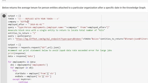
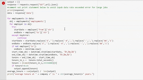
The range of automated inputs allow Diffbot’s Knowledge Graph to cover a huge range of commercially interesting data types. As of the time of this article’s writing, our data coverage included the following, all linked and with an average of 31 facts per entity:

  • 243MM organization entities
  • 773MM person entities
  • 1,879MM image entities
  • 1,621 article entities
  • 880MM post entities
  • 128MM discussion entities
  • 141MM product entities
  • 89MM video entities
  • 20MM job entities
  • 42MM event entities
  • .56M FAQ entities
  • 73MM miscellaneous entities
  • 10MM place entities
  • 49MM creativeWork entities
  • .17MM intangible entities

Total: 5,953MM entities

We’ll jump into additional comparisons of data within Diffbot and Google knowledge graphs in the next section. But hopefully you can begin to see the fundamental differences between a Knowledge Graph built for automated fact accumulation from the start (Diffbot) and one built with manual processes (Google). 

Benchmarking Google And Diffbot’s Knowledge Graphs

While there are substantial coverage differences between entity types in Google and Diffbot knowledge graphs, organization entities are well represented in both. Organization entities are also of broad commercial interest, with uses ranging from market intelligence, to supply chain risk analysis, to sales prospecting. 

For our study of Google and Diffbot knowledge graph organizational coverage, we looked at a representative number of randomized head entity and long tail organizations. Head entity organizations in this case are publicly-traded companies randomly chosen from the Russel 2000 index. Long tail entities include a random sampling of Series A and earlier startups with less than 50 employees. 

For both head entity and long tail organizations, we sought out external records of truth on a range of fields including:

  • CEO
  • Headquarter location
  • Number of employees
  • Revenue
  • And homepage URL

Example “ground truth” publications included SEC financial filings, Crunchbase, and Linkedin.

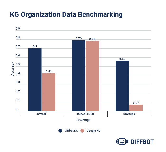
The results of our analysis show strong coverage of head entities across both knowledge graph providers. In this instance, lack of coverage centered around missing “ground truth” revenue fields in the case of several publicly traded companies who are yet to generate revenue. 

Among startups, a substantial spread emerged. For many uses, SMB/MMKT data is particularly hard to come by at scale, and Diffbot’s coverage includes 100’s of millions of “longtail” entities. 

An organization entity within Diffbot’s visual interface for Knowledge Graph search

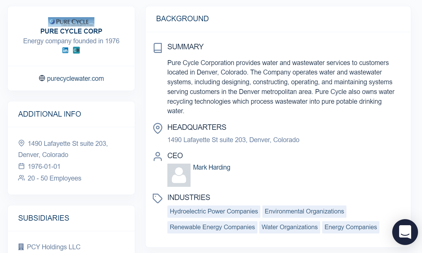
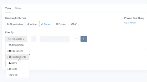
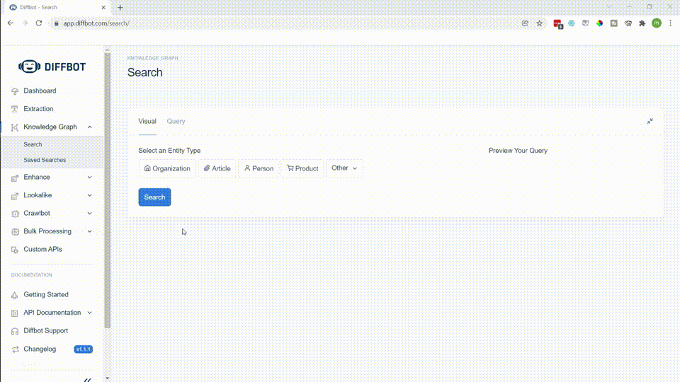
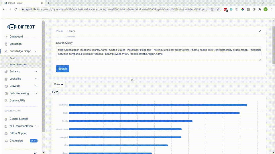
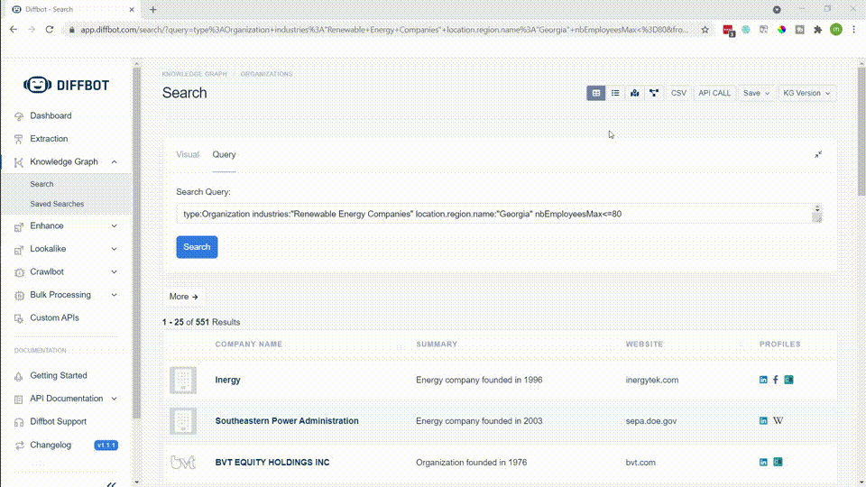
While we chose fields present for organizations in both knowledge graphs, Diffbot’s Knowledge Graph also provides a wider range of additional fields. Above is a screenshot from our Knowledge Graph search visual interface. But additional fields attached to most organization entities within the Knowledge Graph include:

  • Noteworthy Employees
  • News Coverage
  • Industries
  • Locations
  • Subsidiaries
  • Funding Rounds
  • Descriptions
  • Revenue (or estimated revenue)
  • Similar organizations 
  • Technologies used
  • Among many other fields. 
The same entity as it’s presented in Google’s search interface

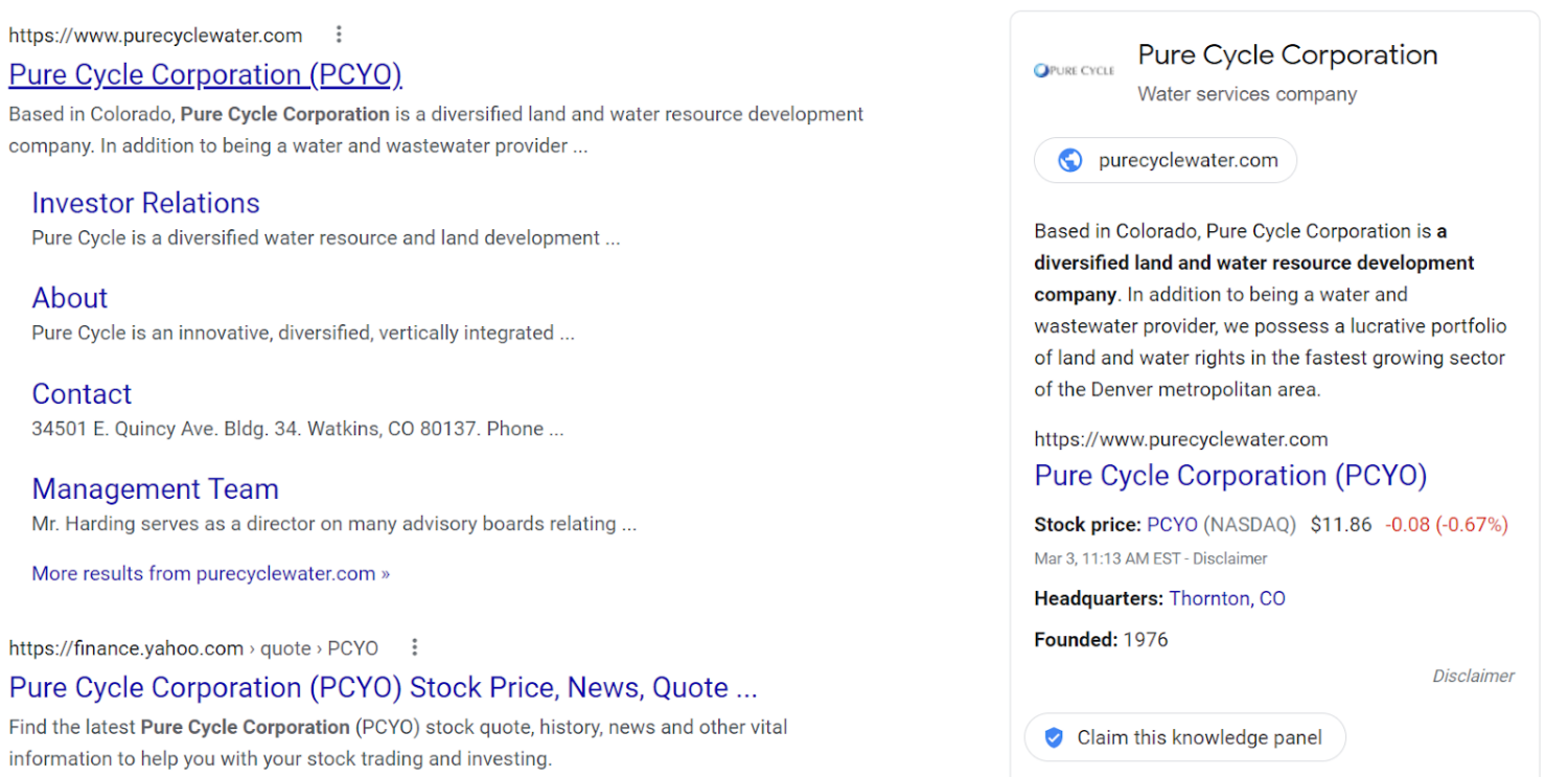
In the Google knowledge graph derived knowledge panel, the only three fields not presented by an external API (Google Finance) are a brief description, the URL of the organization, and the logo. 

While we’ve presented but a handful of samples within this article, Diffbot routinely benchmarks wide ranges of our knowledge graph against competitors and can patently say we have the world’s most accurate and up-to-date large-scale knowledge graph.

Interested in exploring Diffbot Knowledge Graph data for yourself? Grab a free trial or reach out to our sales team for a custom demo.


Data Trends: Comparing Data Fabrics, Data Meshes, And Knowledge Graphs

Data meshes, fabrics, and knowledge graphs are all positioned as frameworks through which similar benefits are realized. 

All three promote interoperability and ease of integrating new data sources. To varying degrees all three support real-time and event-driven data ingestion and processing. All three seek to avoid flat data output, data that needs additional processing time once it has been extracted, and orphaned data that becomes progressively stale. Additionally, with the focus on myriad (and a growing number of) data sources, robust data governance and semantic enrichment is at the forefront of each of these systems. 

With that said, there are differences between data mesh, fabric, and knowledge graphs. 

What Is A Data Fabric?

Data fabric is an architecture-centered design concept governing data access across many decentralized data sources. Initial ideas behind the development of data fabric methodologies include costly, slow, and low value data integration cycles common to centralized data lakes or warehouses. The aspirations of data fabric systems are to promote connectivity of disparate data sources as well as reusability by avoiding issues such as orphaned data or large volumes of extraneous data that tend to compile in centralized data stores. 

A focus on value-added data integration is central to the notion of data fabrics. Systems for semantic enrichment, linked data, and the harmonization of a variety of unstructured, semi-structured, and structured data are key for successful data fabric delivery. The creation of these systems is not decentralized. As such in a data fabric, data access is centralized and held under a single point of control.

Where available, data fabric makes data available via objective-centered APIs. For example, in the event a user needs to build a dashboard comparing hiring trends of competitors with news monitoring around noteworthy market events, a data fabric approach would involve first ingesting these disparate data sources, adding context or additional fields to data, then exposing the data as an API for the dashboard. 

What Is A Data Mesh?

First and foremost, data mesh is an organization-centered approach to data management. A data management system built with data mesh-centric principles enables users to access and query data from a variety of sources without first ingesting this data into a centralized warehouse. While architecture design is part of a data mesh, it is not as central to the characterization of a data mesh as to a data fabric. 

From an organizational perspective, data mesh views each edge data source as a product owned by a business unit in charge of that domain. In relation to these decentralized data stores, data mesh serves as a connectivity layer that is built such that both technical and non-technical users can utilize data sets where they reside. 

Ingestion of data closer to the source – without the need for transfer and ingestion into a central repository – can lower processing costs, decrease time-until analysis, and avoid privacy issues regarding data transferred between particular geographies. 

What Is A Knowledge Graph? 

Contrary to data meshes and fabrics, a knowledge graph is not a connectivity-layer-centric solution or a data management imperative. 

Knowledge graphs are graph databases that are built to preserve information and context. In particular, knowledge graphs are built around nodes (entities) and edges (relationships). Though data can be outputted in a format similar to a relational database, knowledge graphs provide better performance traversing through linked data and are much more adept at adding new fact types and data source formats “on the fly.” 

This makes knowledge graphs a natural choice for high velocity and variable type data like those used in news or market monitoring.  Data is linked and often augmented with additional semantic features upon ingestion in knowledge graphs, aligning with the objectives of data fabrics. For example, within Diffbot’s Knowledge Graph we have organization entities for which we can infer detailed industry fields, machine learning-computed estimated revenue, as well as similarity scores between organizations. 

Use of knowledge organization systems (KOS) aligns with data fabric and mesh goals to add additional semantics to variable incoming data streams and promote linked data. KOS’s commonly utilized in Knowledge Graph construction include: 

  • Glossaries/synonym rings: properly merge facts attached to entities mentioned in multiple ways
  • Unique identifiers: disambiguate entities with the same name (Apple Inc vs. Apple the fruit) 
  • Taxonomies: classify new entities in relation to old entities allowing for additional inferences (California is a state in the United States, therefore San Francisco is in the United States) 
  • Associative clustering: track loose relationships and similarities between entities (Pho is often associated with Vietnamese restaurants; machine learning engineers often work at AI startups)
  • Ontologies: rules, properties, constraints to entities and relationships (only organizations have funding rounds)

Also similar to data fabrics, knowledge graphs are often constructed with a single centralized data access via an API or integrations.

As the provider of the world’s largest commercially-available Knowledge Graph, Diffbot has seen many successful use cases for Knowledge Graph data. These uses include:

  • Market monitoring: tracking of firmographic changes and key events
  • Product intelligence: building knowledge graphs of related products 
  • News monitoring: tracking key events and relationships in the news
  • Machine learning: easy labeled data with context leads to quick workflows and explainability  
  • Sales development: ability to filter through detailed firmographics and person records
  • Hiring and investing: track attrition, skill sets, and meaningful organizational events
  • Data enrichment: easily digestible structured and linked data with expanding field types
  • Product Recommendations: serve up recommendations based on associated behaviors and products
  • Discussion tracking: velocity, sentiment, and influencer tracking
  • Fake news detection: the ability to corroborate facts across millions of articles and train models to predict accuracy of statements
  • Fraud detection: the ability to visualize and track complex relationships between regulatory bodies, private organizations, and key individuals
  • Supply chain / risk: the ability to visualize and track partnerships, key events, suppliers, vendors, locations, and hiring trends

Of course, many of the use cases above can also be supported with data fabrics and meshes. But where meshes and fabrics describe an entire ecosystem of data use and structure across an organization, knowledge graphs excel to a noteworthy degree in support of augmentation of other data stores as well as specific tasks. 

Is It Really About All Three? 

There are pros and cons to using any three of the knowledge management frameworks listed above. And it’s often not a choice of either/or. Data fabrics benefit from a single point of connectivity that can serve up standardized and semantically-enriched data from disparate internal and external sources. A data mesh may be suitable for underlying portions of an organization where agility is more heavily prized. A data source of record can then be supplied for integration and release from a central point (data fabric) for other teams. 

Additionally, data held in knowledge graphs may make sense for certain use cases within an organization utilizing a data fabric and/or mesh. A focus on interoperability and easy integration makes knowledge graph data great for augmentation and enrichment of data sets in other formats. A focus on providing context for information supports explainability, making knowledge graph data a preferred choice for machine learning and data science-centered initiatives within an organization.

Care to learn more about the world’s largest commercially-available Knowledge Graph? Reach out to our sales team today. 

Calculating Average Employee Tenure And Attrition With Diffbot’s Knowledge Graph

Data on the talent distribution at organizations is available across the public web. Github, Crunchbase, personal blogs, press releases, and LinkedIn profiles (among others) can lead to insights into hiring, firing, and skill sets.

Historically, tracking tenure or attrition data across large organizations required a ton of manual fact accumulation or commissioning a market intelligence report.

Today, this information can be read by web-reading bots. Diffbot is one of three North American organizations with a claim to crawling the entire web. And our bots extract relevant facts about organizations, people, skills, and more. These facts are then incorporated into the world’s largest commercial Knowledge Graph (try it out for two weeks free today).

In this guide we’ll look at how you can gain tenure and attrition data for organizations in the Knowledge Graph. As some organizations can be quite large, we’ll talk through topics like monitoring the number of calls you’re making to conserve search credits, as well as how you can segment through portions of an organization (e.g. ‘tenure for engineers’ or ‘tenure for management’).

Prerequisites

  • A trial or paid account for Diffbot’s Knowledge Graph
  • For average tenure, knowledge of Python or willingness to follow along with our step-by-step instructions and template script
  • For attrition, willingness to follow along in our visual Knowledge Graph search interface with step-by-step instructions
  • The name of an organization you’re interested in tracking tenure or attrition for

Tracking Average Tenure At An Organization In Diffbot’s Knowledge Graph

We’ve set up a Google Colaboratory notebook that you can copy to begin your investigation. Why do we need Google Colab and a script? Because some particularly large organizations can have tens or hundreds of thousands of employees (person entities in our Knowledge Graph). We’ll need to wrangle the start and (potential) end dates of their employments to calculate tenure. It’s simply easier to wrangle that much data with our Knowledge Graph API and a short script.

If you’re unfamiliar with Google Colab or Jupyter Notebooks, you run individual blocks of code by pressing the play button to the left of each block. You’ll need to start by running the first block of code (above) which imports all dependencies needed for the project.

Next you can see that we have two additional blocks of code. They both make API calls to our Knowledge Graph API but return slightly different data. The first returns the average tenure of all employees (person entities) past a certain date at a specific organization. The second returns tenure for a specific job function within an organization.

To begin, you’ll need to locate your token. This will grant you API access to the Knowledge Graph. Your API token can be viewed by clicking the “API Token” button in the top right hand corner of the Diffbot Dashboard.

Copy your full token from the top line of the page that loads and paste this into the two lines within the Google Collab that start with TOKEN= between the quotation marks.

Next we can choose the organization we want to track as well as the date we want to start our inquiry. In other words, if the company has a long history, do you want to see average tenure after a specific date? Note that you’ll need to keep the date field in single quotes inside of double quotes (as it is originally presented). Additionally, the date format used is YYYY-MM-DD.

Notice that our variable entities_to_return is set to one. So as to be mindful of Knowledge Graph API credit usage, we’ll use our initial query to only return full data on one entity (a single person). Once you click the “play” button to run the code, you should see some output at the bottom of this block of code. If you tried Microsoft for the dates I’ve entered, you should see the following.

{'version': 1, 'hits': 90419, 'results': 1, 'kgversion': '235',...

What we’re looking for here is the “hits” number. This is the total number of entities matching our query. So in the case of this example, there are 90,419 person entities who have worked at Microsoft since the first day of 2017. For very large organizations, loading this much data can take some time (and consume many credits), so you’ll need to decide whether you want to shift the timeframe you’re looking at or the number of credits are justified. For your trial run, you can also just try a smaller organization to conserve credits.

Once you have a timeframe and organization you think will lead to an interesting insight, take the value after 'hits': and use it to replace 1 in the entities_to_return variable.

Next you’ll want to comment out the line that says print(response). This will avoid a memory error attempting to print the entire output of of queries for large organizations. To comment out a line, simply add # in front of it.

Next click run, a query returning data on thousands of employees may take some time. But most organizations should be quite quick.

If you’ve followed all the steps above, your results should populate the bar below the block of code you just executed!

To obtain tenure by category of employment, skip to the next block of code.

Our process here is the same as the above with one addition, you’ll want to replace the employment category. You can gain a view of all of our employment categories within our Knowledge Graph search dashboard.

  1. Select person entity
  2. Select filter by employment then categories
  3. Browse a list of job functions

Once you’ve inputted an organization, a date, and a category of employment, click run.

Like our previous example, we’ll evaluate the number of ‘hits’ (person entities showing up in results). If you’re satisfied with the number to evaluate, comment out the print statement detailed in the past example and place the ‘hits’ number as the value for the entities_to_return variable. Then run the code to see the average tenure for workers in a specific work function.

You’re done! Want to utilize the same script to calculate average tenure for segments of employees other than these? Familiarize yourself with Diffbot Query Language and craft a person entity query of your own. Place this value inside of the line of code starting with query =.

Calculating Attrition At An Organization In Diffbot’s Knowledge Graph

The point of the script in the last example was largely just to work with large numbers of dates for the start and end of person entity employments. In this example, we simply want absolute numbers for headcount and employees who have left. These are numbers we can find directly within the visual search interface for the Knowledge Graph.

Because attrition is measured across a time period, you may want to look for how many employees an organization had at the start of a given period. Organization entities within the Knowledge Graph have a field noting their present headcount. But for a specific date in the past we’ll be looking at the employment fields attached to person entities.

Let’s say you want to see attrition for all employees at Netflix since 2015. You can copy the following query to gain those employed before 2016.

type:Person employments.{employer.name:"Netflix" from<"2016-01-01" or(to>"2016-01-01", not(has:to))}

The curly braces in this example are an example of a nested query (learn more here). In this case we’re saying return all person entities who both have an employer named Netflix and were employees there from before the first day of 2016.

The final “or” statement is expressing the fact that we want results returned who worked at Netflix at least into the start of 2016, and to include individuals who don’t have an employed “to” (e.g. last day or work) value. This last portion excludes individuals who worked before 2016 but also left before 2016.

The results include 3,324 employees at Netflix (as of 2016-01-01). For this investigation this can be our baseline to see the percentage of attrition.

To see what the makeup of the org was at this point, feel free to add facet:employments.categories.name to the end of the query. This results in a breakdown of the employment category of Netflix at this point in time.

Employment categories of employees at Netflix as of 2016-01-01

Next we simply alter our query slightly to see who has left. This time we want to see employees who worked at Netflix as of the first day of 2016, but later left. We can do this simply by removing not(has:to) and replacing it with has:to. This is specifying that we want individuals who have a “to” (ending) date to their employment.

This query would look like the following:

type:Person employments.{employer.name:"Netflix" from<"2016-01-01" to>"2016-01-01" has:to}

1,289 of the original cohort have left since 2016. Or an attrition rate of ~39%.

By adding the same facet query to the end, we can see which roles within this cohort have had the most (or least) attrition.

Perhaps interestingly, attrition rates largely follow the general distribution of talent in our original cohort. In short, there isn’t a major branch of the business with disproportionately high attrition.

You can perform queries on attrition within particular roles by removing the portion of the query about categories and replacing this with employments.employer.title:"Title of Job".

Additionally of note is that above we’re working through the attrition of a particular hiring cohort(s) (pre-2016 hires). Obtaining a raw look at attrition over a time period is a simpler query.

In the case of Netflix, they’ve performed the bulk of their hiring since 2016. So total attrition numbers may be more informative than looking at a 2016 baseline.

The query format for obtaining a list of all individuals who have left an employer since a specific date can be found thus:
type:Person employments.{employer.name:"Netflix" to>"2016-01-01" has:to}

This query results in 7,555 person entities returned. And what we’re looking at here are individuals employed at any point after 2016 for Netflix who have left.

The same facet query used above for this query shows us turnover is largely among performers and entertainment roles, followed by management and design.

Job function counts of employees who have left Netflix since 2016

So there we have it! The ability to calculate attrition and tenure for individuals working at any of the hundreds of millions of organizations within the Knowledge Graph. For hiring data, note that you can invert from and to dates to see new additions to organizations.


Looking for more examples of market intelligence, competitive intelligence, and firmographic Knowledge Graph queries, be sure to check out our guide to market intelligence search queries!

17 Uses of Natural Language Processing (NLP) In Business Settings

The Library of Alexandria was the pinnacle of the ancient world’s recorded knowledge. It’s estimated that it contained the scroll equivalent of 100,000 books. This was the culmination of thousands of years of knowledge that made it into the records of the time. Today, the Library of Congress holds much the same distinction, with over 170M items in its collection.

While impressive, those 170M items digitized could fit onto a shelf in your basement. Roughly 10 12 terabyte hard drives could contain the entirety.

For comparison, the average data center of today (there are 7.2M of them at last count) takes up an average of 100,000 square feet. Nearly every foot filled with storage.

With this much data, there’s no army of librarians in the whole world who could organize them…

Natural language processing refers to technologies and techniques that take unorganized data and provide meaning and structure at scale. Imagine taking a stack of documents on your desk, making them searchable, sortable, prioritizing them, or generating summaries for each. These are the sort of tasks natural language processing supports in business and research settings.

At Diffbot, we see a wide range of use cases using our benchmark-topping Natural Language API. We’ll work through some of these use cases as well as others supported by other technologies below.

Sentiment Analysis

These days, it seems as if nearly everyone online has an opinion (and is willing to share it widely). The velocity of social media, support ticket, and review data is astounding, and many teams have sought solutions to automate the understanding of these exchanges.

Sentiment analysis is one of the most widespread uses of natural language processing. This process involves determining how “positive” or “negative” a given text is. Common uses for sentiment analysis are wide ranging and include:

  • Buyer risk
  • Supplier risk
  • Market intelligence
  • Product intelligence (reviews)
  • Social media monitoring
  • Underwriting
  • Support ticket routing
  • Investment intelligence

While no natural language processing task is foolproof, studies show that analysts tend to agree with top-tier sentiment analysis services close to 85% of the time.

One categorical difference between sentiment analysis providers is that some provide a sentiment score for entire documents, while some providers can give you the sentiment of individual entities within the text. A second important factor about entity-level sentiment involves knowing how central an entity is to understanding the text. This measure is commonly called the “salience” of an entity.

Text Classification

Text classification can refer to a process internal to natural language processing tools in which text is grouped into related words and prepared for further analysis. Additionally, text (topic) classification can refer to the user output of greater business use.

The uses of text (topic) classification include ticket or call routing, news mention tracking, and providing contextuality to other natural language processing outputs. Text classification can function as an “operator” of sorts, routing requests to the person best suited to solve the issue.

Studies have shown that the average support worker can only handle around 20 support tickets a day. Text classification can dramatically increase the time before tickets reach the right support team member as well as provide this team member with context to solve an issue quickly. Salesforce has noted that 69% of high-performing support teams are considering the use of AI for ticket routing.

Additionally, you can think of text classification as one “building block” for understanding what is going on in bulk unstructured text. Text classification processes may also trigger additional natural language processing through identifying languages or topics that should be analyzed in a particular way.

Chatbots & Virtual Assistants

Loved by some, despised by others, chatbots form a viable way to direct informational conversations towards self service or human team members.

While historical chatbots have relied on makers plotting out ‘decision trees’ (e.g. a flow chart pattern where a specific input yields a specific choice), natural language processing allows chatbot users several distinct benefits:

  • The ability to input a nuanced request
  • The ability to type a request in informal writing
  • More intelligence judgment on when to hand off a call to an agent

As the quality of chatbot interactions has improved with advances in natural language processing, consumers have grown accustomed to dealing with them. The number of consumers willing to deal with chatbots doubled between 2018 and 2019. And more recently it has been reported that close to 70% of consumers prefer to deal with chatbots for answers to simple inquiries.

Text Extraction (Mining)

Text extraction is a crucial functionality in many natural language processing applications. This functionality involves pulling out key pieces of information from unstructured text. Key pieces of information could be entities (e.g. companies, people, email addresses, products), relationships, specifications, references to laws or any other mention of interest. A second function of text extraction can be to clean and standardize data. The same entity can be referenced in many different ways within a text, as pronouns, in shorthand, as grammatically possessive, and so forth.

Text extraction is often a “building block” for many other more advanced natural language processing tasks.

Text extraction plays a critical role in Diffbot’s AI-enabled web scraping products, allowing us to determine which pieces of information are most important on a wide variety of pages without human input as well as pull relevant facts into the world’s largest Knowledge Graph.

Machine Translation

Few organizations of size don’t interface with global suppliers, customers, regulators, or the public at large. “Human in the loop” global news tracking is often costly and reliant on recruiting individuals who can read all of the languages that could provide actionable intelligence for your organization.

Machine translation allows these processes to occur at scale, and refers to the natural language processing task of converting natural text in one language to another. This relies on understanding the context, being able to determine entities and relationships, as well as understanding the overall sentiment of a document.

While some natural language processing products center their offerings around machine translation, others simply standardize their output to a single language. Diffbot’s Natural Language API can take input in English, Chinese, French, German, Spanish, Russian, Japanese, Dutch, Polish, Norwegian, Danish or Swedish and standardize output into English.

Text Summarization

Text summarization is one of a handful of “generative” natural language processing tasks. Reliant on text extraction, classification, and sentiment analysis, text summarization takes a set of input text and summarizes it. Perhaps the most commonly utilized example of text summarization occurs when search results highlight a particular sentence within a document to answer a query.

Two main approaches are used for text summarizing natural language processing. The extraction approach finds a sentence(s) within a text that it believes coherently summarizes the main points of the document. The abstraction approach actually rewrites the input text, removing points it believes are less important and rephrasing to reduce length.

The primary benefit of text summarization is the preserving of time for end users. In cases like question answering in support or search, consumers utilize text summarization daily. Technical, medical, and legal settings also utilize text summarization to give a quick high-level view of the main points of a document.

Market Intelligence

Check out a media monitoring dashboard that combines Diffbot’s web scraping, Knowledge Graph, and natural language processing products above!

The range of data sources on consumers, suppliers, distributors, and competitors makes market intelligence incredibly ripe for disruption via natural language processing. Web data is a primary source for a wide range of inputs on market conditions, and the ability to provide meaning while absolving individuals from the need to read all underlying documents is a game changer.

Applied with web crawling, natural language processing can provide information on key market happenings such as mergers and acquisitions, key hires, funding rounds, new office openings, and changes in headcount. Other common market intelligence uses include sentiment analysis of reviews, summarization of financial, legal, or regulatory documents, among other uses.

Intent Classification

Intent classification is one of the most revenue-centered and actionable applications of natural language processing. In intent classification the input is direct communications from a prospect or customer. Using machine learning, intent classification tools can rate how “ready to buy” a given individual is during an interaction. This can prompt sales and marketing outreach, special offers, cross-selling, up-selling, and help with lead scoring.

Additionally, intent classification can help to route inquiries aimed at support or general queries like those related to billing. The ability to infer intentions and needs without even needing to prompt discussion members to answer specific questions enables for a faster and more frictionless experience for service providers and customers.

Urgency Detection

Urgency detection is related to intent classification, but with less focus on where a text indicates a writer is within a buying process. Urgency detection has been successfully used in cases such as law enforcement, humanitarian crises, and health care hotlines to “flag up” text that indicates a certain urgency threshold.

Because urgency detection is just one method — among others — in which communications can be routed or filtered, low or no supervision machine learning can often be used to prepare these functions. In instances in which an organization does not have the resources to field all requests, urgency detection can help them to prioritize the most urgent.

Speech Recognition

In today’s world of smart homes and mobile connectivity, speech recognition opens up the door to natural language processing away from written text. By focusing on high fidelity speech-to-text functionality, the range of documents that can be fed to natural language processing programs expands dramatically.

In 2020, an estimated 30% of all searches held a voice component. Applying natural language processing detailed in the other points in this guide is a huge opportunity for organizations providing speech-related capabilities.

Search Autocorrect and Autocomplete

Search autocorrect and complete may be the area most individuals deal with natural language processing most readily. In recent years, search on many ecommerce and knowledge base sites has been entirely rethought. The ability to quickly identify intent and pair it with an appropriate response can lead to better user experience, higher conversion rates, and more end data about what users want.

While 96% of major ecommerce sites employ autocorrect and/or autocomplete, major benchmarks find that close to 30% of these sites have severe usability issues. For some of the largest traffic volume sites on the web, this is a major opportunity to employ quality predictive search using cutting-edge natural language processing.

Social Media Monitoring

Of all media sources online, social can be the most overwhelming in velocity, range of tone and conversation type. Global organizations may need to field or monitor requests in many languages, on many platforms. Additionally, social media can provide useful inputs into external issues that may affect your organization, from geopolitical strife, to changing consumer opinion, to competitor intelligence.

On the customer service and sales fronts, 79% of consumers expect brands to respond within a day on social media requests. Recent studies have shown that across industries only 29% of brands regularly hit this mark. Additionally, the cost of finding new customers is 7x that of keeping existing customers, leading to increased need for intent monitoring and natural language processing of social media requests.

Web Data Extraction

Rule-based web data extraction simply doesn’t scale past a certain point. Unless you know the structure of a web page in advance (many of which are changing constantly), rules specified for which information is relevant to extract will break. This is where natural language processing comes into play.

Organizations like Diffbot apply natural language processing for web data extraction. By training natural language processing models around what information is likely useful by page type (e.g. product page, profile page, article page, discussion page, etc.), we can extract web data without pre-specified rules. This leads to resiliency in web crawling as well as enables us to expand the number of pages we can extract data from. This ability to crawl across many page types and continuously extract facts is what powers our Knowledge Graph. Interested in web data extraction? Be sure to check out our automatic extraction APIs or pre-extracted firmographic, demographic, and article data within our Knowledge Graph.

Machine Learning

See how ProQuo AI utilizes our web sourced Knowledge Graph to speed up predictive analytics

While machine learning is often an input to natural language processing tools, the output of natural language processing tools can also jumpstart machine learning projects. Using automatically structured data from the web can help you skip time-consuming and expensive annotation tasks.

We routinely see our Natural Language API as well as Knowledge Graph data — both enabled with natural language processing technology — utilized to jump start machine learning exercises. There are few training data sets as large as public web data. And the range of public web data types and topics makes it a great starting point for many, many machine learning journeys.

Threat Detection

See how FactMata uses Diffbot Knowledge Graph data to detect fake news and threats online

For platforms or other text data sources with high velocity, natural language processing has proven to be a good first line of defense for flagging hate speech, threatening speech, or false claims. The ability to monitor social networks and other locations at scale allows for the identification of networks of “bad actors” and a systemic protection from malicious actors online.

We’ve partnered with multiple organizations to help combat fake news with our natural language processing API, site crawlers, and Knowledge Graph data. Whether as a source for live structured web data or as training data for future threat detection tools, the web is the largest source of written harmful or threatening communications. This makes it the best location for training effective natural language processing tools used by non-profits, governmental bodies, media sites looking to police their own content, and other uses.

Fraud Detection

Natural language processing plays multiple roles in fraud prevention efforts. The ability to structure product pages is utilized by large ecommerce sites to seek out duplicate and fraudulent product offerings. Secondly, structured data on organizations and key members of these organizations can help to detect patterns in illicit activity.

Knowledge graphs — one possible output of natural language processing — are particularly well suited for fraud detection because of their ability to link distinct data types. Just as human research-enabled fraud investigations “piece together” information from varying sources and on various entities, Knowledge Graphs allow for machine accumulation of similar information.

Native Advertising

For advertising embedded in other content, tracking what context provides the best setting for ad placement allows for systems to generate better and better ad placement. Using web scraping paired with natural language processing, information like the sentiment of articles, mentions of key entities as well as which entities are most central to the text can lead to better ad placement.

Many brands suffer from underperforming advertising spending as well as brand safety (placement in suitable locations), problems that natural language processing helps to aid at scale.

Analyze Your Total Addressable Market (TAM) With Diffbot’s Knowledge Graph

Total addressable market (TAM) is the — hopefully — large figure that represents potential revenue for a given product or service. These figures are useful for fundraising, assessing market saturation, and the prioritization of opportunities.

In our recently published guide to writing a market intelligence report with the Knowledge Graph we worked through creating a report for a fictitious Acme Energy. Acme Energy provides backup energy services and energy disruption mitigation for hospitals. In this guide we’ll work through finding and visualizing three useful TAM-related datasets with Diffbot’s Knowledge Graph.

In particular, we’ll look at how you can quickly surface the datasets needed for the following three visualizations:

Prerequisites

  • Access to Diffbot’s Knowledge Graph (find a free two week trial here)
  • Google Sheets (or equivalent spreadsheet software)
  • I’ll use Infogram to visualize the data. Feel free to use any charting tool with mapping capabilities.

Step One: Define Service Set

There are three ways to calculate TAM, one of the most straightforward (if you have existing products or services) is as follows:

  • (# of potential customers) x (annual contract value)

In our case let’s look at a hypothetical in which Acme Energy sells two service sets.

  • $5,000 ACV deals to hospitals with less than 500 employees
  • $100,000 ACV deals to hospitals with greater than 500 employees

Because we have two distinct sets of customers here, we’ll need to calculate both TAMs separately and add them together. In particular, we’ll need to calculate the following:

  • (# of hospitals with less than 500 employees) x $5,000
  • (# of hospitals with more than 500 employees) x $100,000

In the next step we’ll find our figures for the first portion of these formulas.

Step Two: Calculate Total Addressable Market

In Diffbot’s Knowledge Graph we can query for organizations based on specific firmographics. Both industries and number of employees are attached to organizations, which makes it easy to return the number of hospitals needed for our calculation. Below I’ll show two routes to obtaining your data. The first will utilize the visual query builder, which allows you to craft basic search queries in a beginner-friendly way. The second involves using Diffbot Query Language (DQL), which is slightly more involved, but allows for greater control over your query. New to using DQL? Start by simply pasting in the queries typed out below or check out our DQL Quick Start guide.

Using the Visual Query Builder

We can form an initial hospital query using a few fields: industries, nbEmployees, and location. Start by choosing the type of entity you want returned (organization). Then simply toggle the location to United States, the industry name to hospitals, and the nbEmployees to <=500.

One quick query returns over 100,000 results! To obtain the second group of hospitals (with greater than 500 employees), simply alter the nbEmployees field. Also of note to the right of the screen is the preview of your query. This shows you the DQL version of your query and is a great way to start familiarizing yourself with what this query language looks like.

Using Diffbot Query Language

While this visual query is a great starting point, this particular data set could use some more work. As I looked through the returned organizations I saw some veterinary hospitals, optometric clinics, and home health businesses returned. While these may in some senses be “hospitals,” they aren’t what we’re looking for here. This is an instance in which DQL comes in handy.

The eventual query I settled on specifies that we don’t want organizations who are in sometimes related industries to hospitals, and that “hospital” should be in the name of the organization returned. This seemed to provide the most reliable dataset.

type:Organization locations.country.name:"United States" industries:"Hospitals" not(industries:or("optometrists","home health care","physiotherapy organization", "financial services companies")) name:"Hospital" nbEmployees>=500

This query returns 1,244 results, the number of large hospitals for one half of our TAM equation. By changing the nbEmployees to nbEmployees<=500 we can find our other number. Plugged into the equation this means that our TAM is as follows.

  • (1,244 x $100,000) + (11,151 x $5,000) = $180,155,000

While we could export all of this data, using DQL enables facet queries, which are a useful way to quickly summarize the results of a specific field. In this case we can use this to return a summary of which states provide the most TAM.

type:Organization locations.country.name:"United States" industries:"Hospitals" not(industries:or("optometrists","home health care","physiotherapy organization", "financial services companies")) name:"Hospital" nbEmployees<=500 facet:locations.region.name

To obtain the complete dataset we'll yet again need to alter the nbEmployees field and then download the results. I ended up pulling both datasets into the same spreadsheet to perform the simple TAM arithmetic to all states at once.

After converting the number of large and small hospitals per state into state-by-state TAM, we can analyze the data as we wish. In my case I pulled the numbers into a data visualization tool to see which regions have the largest opportunities.

What we've done here is quickly survey the number of hospitals by location and size across the United States. This search wouldn't have been possible in consumer search engines. And it's a good starting point. But the general trend above is still similar to a population density map. Perhaps there's more we can do to surface where opportunity lies for our fictitious Acme Energy.

Step Three: Analyze Competitors

In case our initial query of small hospitals didn't show this to be the case, the Knowledge Graph excels at long tail (SMB and MMKT) information. We have over 250M organizations in total, with solid coverage worldwide and across many, many industries.

To show this at work, let's surface a dataset of Acme Energy's competitors and plot it on a similar map to our TAM by state graphic.

Using the Visual Query Builder

After several exploratory queries, the query that yielded the best results for competitors for Acme Energy relied on the description field. This field is a few sentence summary of what an organization does. While we can look at energy companies from an industry level, this is a much more general query. What we're after here are American companies who provide services related to backup power.

Our visual query builder results return 327 backup energy providers across the United States. Clicking through some of the organization's profiles, they offer the precise service set of Acme Energy. The only downside to using the visual query builder is that there is not presently the ability to facet (provide a summary view). This means that you would need to export the data to csv and do a small bit of data wrangling to determine the number of competitors by state.

Using Diffbot Query Language

With Diffbot Query Language we can use the same query as we generated with the visual query builder and simply add a facet statement to the end (similarly to how we faceted to gain TAM by state).

type:Organization description:"backup power" location.country.name:"United States" facet:locations.region.name

After exporting our facet view, we can move straight to visualization or analysis.

Step Four: Analyze Competitors By TAM

While our competitors map largely also follows population density (with the exception of New York), with some simple arithmetic we can gain an even clearer view of where opportunity may lie.

Using our datasets for TAM by state and competitors by state, we can simply divide the two to provide a general view of how much unclaimed market there is.

Loading the resulting data into the same format provides the following visualization:

While state-by-state location may not matter for some industries (say, SAAS), many market intelligence analyses go to great depth to obtain state-by-state data. In this case we've surfaced relative opportunity in North Dakota and Iowa that wasn't present in our initial data set.

Our Knowledge Graph is based on web-wide crawls that update our organization database every few days. Want to see what coverage is like for your industry? Try out a free two-week trial or contact sales for a customized demo!

Create A Market Intelligence Report In 30 Minutes With Diffbot

Market intelligence is the tracking and analysis of all important parties within a given market. In particular, market intelligence commonly looks at competitors, suppliers, governmental agencies, product offerings, customers, and broader trends.

Market intelligence can inform a range of tasks including (but not limited to):

  • Minimizing risk of new investments
  • Identifying new markets to enter
  • Increasing market share
  • Informing (or updating) ideal customer segments
  • Developing brand positioning
  • Assessing risks or opportunities in supply chain and production

In this quick guide we’ll work through reasons why the following market intelligence metrics are important, as well as how to gain market intelligence insights with Diffbot’s Knowledge Graph.

Calculating Total Addressable Market (TAM) Using Diffbot’s Knowledge Graph

Smart investors and management teams lean back on total addressable market (TAM) and related measurements to discern what level of opportunity a given service set has. A total addressable market is a measurement depicting the total potential sales given complete market saturation and with no monetary (or otherwise) constraints in providing this many services. Accurate TAM assessments can provide an early guidepost for product market fit as well as where opportunities are.

There are three primary routes to determine TAM, each with a set of trade-offs.

The “top down” method, looks at a well established industry as a whole. This form of research typically relies on analyst firms as middle men, and can enable you to say something like “Gartner estimates solar panel sales could reach X by Y.” This is a fine starting point and a bit of a gut check, but this method typically relies on the trust in a particular research firm and doesn’t provide a ton of detail about how results were created (or the underlying data set).

The “bottom up” method is a great choice for organizations who have already sold some of their products. It enables you to do your own research and understand the nuances of the underlying data. In the bottom up method you’ll take your annual contract value and multiply it by the number of organizations who fit a specific firmographic profile. This can enable you to gain a set of granular and related data points. For example, the TAM of solar energy in Texas (versus, say, Arizona).

The “value-theory” method adjusts the annual account value input to a TAM by providing an educated guess as to what individuals “could” be willing to spend for the value of your product. This can be accomplished by looking at competitors, or combining the value of multiple markets in the event your service is creating a new category.

For our purposes here, we’ll jump into the “bottom up” method, which provides the most underlying data and can be constructed “in house.”

Diffbot’s Knowledge Graph has unrivaled longtail and midmarket coverage for organizations through our web-wide fact extraction. The inclusion of a range of firmographics, technographics, and employee demographics allows for uniquely granular and accurate calculation of TAM values.

In our hypothetical, let’s calculate TAM for a company that makes backup energy sources for hospitals. They serve two primary industry segments. For community and mid-sized city hospitals that tend to have 500 or less employees, they provide backup energy monitoring and maintenance for a price of $5,000 a year. For larger hospitals that can have thousands of employees, their average annual contract value is $100,000 a year.

Within the Knowledge Graph we can start by assessing the underlying data on hospitals. Our initial query returns over 26,000 organizations who have been tagged as operating in the “hospitals” industry. This seems a bit high, and upon some perusal we can see some optometric, physical therapy, and related industries that are to some degree “hospitals” but not what we’re looking for. We then exclude organizations with these industries and provide a summary view of the number of employees of each one of these organizations.

type:Organization locations.country.name:"United States" industries:"Hospitals" not(industries:or("optometrists","home health care","physiotherapy organization", "financial services companies")) name:"Hospital" facet:nbEmployeesMax

As we can see, the lion’s share of the market aligns with our hypothetical energy provider’s customer profile with less than 500 employees. Though there are several thousand hospitals at their higher price point.

At this point we can facet (summary view) our results to provide total counts for both categories.

type:Organization locations.country.name:"United States" industries:"Hospitals" not(industries:or("optometrists","home health care","physiotherapy organization", "financial services companies")) name:"Hospital" facet[0:500,500:100000]:nbEmployeesMax

Here an initial take on TAM is simple. Simply multiply your two annual contract values by the number of organizations who could sign up.

  • $5,000 x 10,312 = $51,560,000
  • $100,000 x 2,121 = $212,100,000

Add the above to find a total addressable market of $263,660,000. Interestingly, the potential value for much smaller subset of larger hospitals vastly outstrips potential earnings for the many small hospitals.

One aspect in which the Knowledge Graph can provide unrivaled granularity is in the ability to quickly provide views of different portions of a TAM calculation. These additional calculations may take the form of your total reachable market or related numbers.

For example, let’s say the above TAM number is solid. But for now you only have legal approval to sell your services in the state of Texas. A quick adjustment to our Diffbot Query Language query can provide us with a TAM bounded by Texas.

type:Organization locations.country.name:"United States" locations.region.name:"Texas" industries:"Hospitals" not(industries:or("optometrists","home health care","physiotherapy organization", "financial services companies")) name:"Hospital" facet[0:500,500:100000]:nbEmployeesMax

Here our TAM or related measure has dropped to $3.78MM.

But let’s say our hypothetical organization is working on approval to sell their goods in five additional states.

type:Organization locations.country.name:"United States" locations.region.name:or("Arizona","Colorado","Utah","New Mexico","Oklahoma") industries:"Hospitals" not(industries:or("optometrists","home health care","physiotherapy organization", "financial services companies")) name:"Hospital" facet[0:500,500:100000]:nbEmployeesMax

The TAM calculable from the above states rounds out at $10.5MM. You can likely begin to see how differing views of segments of TAM can become valuable for discerning opportunity and direction.

Extrapolating From Lists of Customers, Competitors, or Suppliers

A common blocker when entering a new market is the ability to gain a circumspect (and global) view of customers, competitors, and suppliers. Manual research can quickly yield a handful of names. But the ability to extend a dataset can yield datasets of meaningful scale for analysis.

All of the 240MM+ organizations within the Knowledge Graph have a machine learning-computed similarTo score for every other organization. This field looks at a wide range of firmographics to determine what organizations are similar to one another.

Presently the input for similarTo queries can include one or two organizations, so it’s a great way to start with a very small number of example organizations and gain a wider list. To utilize similarTo, you’ll need the DiffbotURI (unique identifier) for the organizations you’re interested in. You can gain this simply by searching by name if you already know of an organization. The final portion of the URL attached to the entity will be your unique identifier.

https://app.diffbot.com/entity/EYX1i02YVPsuT7fPLUYgRhQ

SimilarTo queries then follow the following syntax to yield a range of previously unknown (potential) customers, competitors, or suppliers.

type:organization similarTo(type:organization id:"EYX1i02YVPsuT7fPLUYgRhQ")

💡 Tip: have a moderately-sized list of competitors, customers, or suppliers you want to extrapolate from? Use Diffbot’s Google Sheets or Excel Integrations to perform multiple similarTo queries at once.

A second method by which to grow lists of competitors, customers, or suppliers for further analysis takes a top-down approach. There are a range of filters to create lists of companies by industry, size, revenue, location, and more.

One catch-all approach often utilized in market intelligence queries is to utilize the description field. For example, let’s say you’re looking for suppliers of citric acid within a specific region. Citric acid in-and-of-itself is more granular than typical NAICs industry codes, but we can start from a broader industry and use the description field to find a more targeted list.

The below query looks for chemical manufacturing companies in China for whom citric acid is central enough to their offerings to be included in their description.

type:Organization industries:"Chemical Companies" location.country.name:"China" description:"citric acid"

At 56 China-based citric acid manufacturer results, you’re well on your way to a comprehensive review of suppliers of interest.

Calculating Market Share And Saturation With Diffbot’s Knowledge Graph

Now that we have a list of competitors as well as TAM-related metrics, we can begin to look at potential market share and saturation rates.

Of the many fact types that our Knowledge Graph extracts from the public web, revenue (or estimated revenue) is one of the most prominent. For organizations that must publicly disclose revenue, this information is almost always online. For organizations who don’t have to publicly disclose, DIffbot provides a machine learning-computed estimated revenue field. This field looks at scores of firmographics to provide a best guess for what present revenue is.

Again we can approach these measurements from a top-down or bottom-up approach. With a discrete list of competitors we can simply enrich data using Diffbot’s Enhance product. Enhance provides Knowledge Graph data by searching for precise matches of organizations or people. Rather than search using a large OR query, Enhance let’s us enrich organizations in bulk.

Alternatively, if you can find a top-down query specific enough to only provide competitors, you can calculate revenue from what is likely an even larger list. If your competition can be defined by clear cut firmographics, then this is a good route. For example, let’s say all alternative energy providers with less than 50 employees in Georgia are competitors.

type:Organization industries:"Renewable Energy Companies" location.region.name:"Georgia" nbEmployeesMax:50

While 150 results is likely a majority of the market segment you’re looking for in this case, you should be aware of data points surrounding your specifications. For example, perhaps 50 employees is a bit arbitrary. And perhaps some competitors you would be remiss to exclude have around 55 employees. A quick facet query can gut check the distribution of data to ensure you aren’t missing out on data slightly beyond the specifications of your search.

type:Organization industries:"Renewable Energy Companies" location.region.name:"Georgia" facet:nbEmployeesMax

In this summary view of employee counts for renewable energy companies in Georgia you would likely need to rely on industry insight. You could likely exclude 100-500 employee companies as a different segment. But are your competitors truly in the 1-50 employee range (e.g. largely 10-20 employee companies)? Or are your true competitors somewhere in the 50-100 employee bin?

Let’s be safe and export revenue for all companies with less than 80 employees. In the upper right corner of the results screen you can select CSV export, then on the following screen ensure that “revenue value” is toggled.

From this point calculating market share is simple arithmetic.

Ranking Competition With Net Income Per Employee

Ranking competition by net income per employee can point you in the direction of the most mature organizations within your market. This can provide valuable insight into who you should watch, what organizations you can learn from, and what’s working within your market.

We’ve already shown how to export revenue for a range of organizations meeting a specific criteria. The only difference here is you’ll want to export the nbEmployees, nbEmployeesMin, or nbEmployessMax fields to divide by total revenue.

Gauging Organization Sentiment

Thus far we’ve only touched on firmographic-related searches. But a great deal of market intelligence involves analyzing the overall operating environment, future trends, and pending events. This is where news monitoring can come into play. Diffbot’s article index is several times the size of Google News, augmented with natural language processing-enabled fields, and not siloed by location or language.

There are several routes to gaining an article feed of interest. These include:

  • Searching articles by AI-generated topical tags (e.g. “show me all articles about Apple Inc”)
  • Searching articles by AI-generated categories (e.g. “show me all articles about mergers and acquisitions”)
  • Searching articles by publishing location or region (e.g. “show me all articles from these 10 sites” or “show me all articles mentioning petroleum published in Russia”)

In the end, multiple feeds may be consolidated, or portions of the above searches may be combined. Let’s take a look at a feed of mergers and acquisitions related to fintech companies.

type:Article text:"fintech" categories.name:"Acquisitions, Mergers and Takeovers"

💡 Tip: want to find a list of all categories we track across our article index? Be sure to check out our list of categories in our documentation.

Once you have a collection of articles you’re interested in, two useful metrics to track include the velocity of publication as well as the sentiment. In some cases you may want to highlight only positive or negative sentiment, or to showcase a trend surrounding a topic over time.

A facet query can give you a quick distribution of sentiment around a topic. It’s worth noting that there are two “levels” of sentiment within the Knowledge Graph. The first is document-level sentiment, which is visible from within the results page. The second is entity level sentiment. Entity level sentiment provides a view of sentiment pointed at a specific entity within it’s context in an article. While both are valuable, entity-level sentiment is a stronger signal about a precise portion of a story.

One technique to generate a view into the velocity of positive or negative news over a period of time is to facet by publication date for positive (or negative) articles on a topic. A sample query for this looks like the following:

type:Article tags.{uri:"http://diffbot.com/entity/CHb0_0NEcMwyY8b083taTTw" sentiment<0.0} facet[week]:date

As with many facet queries within the Knowledge Graph, the resulting chart is immediately insightful and points to data ranges that might be worth looking into more. In the above example we look at articles tagged with Apple Inc and that are negative sentiment, clustered by week of the last year.

Need to track a custom event across a specific group of articles? You can pass Knowledge Graph or extracted articles to our Natural Language API, which we can quickly help to train to identify custom fact types and entity mentions.

Tracking Shifts In Talent

On top of the 240MM+ organizations in the Knowledge Graph, over 750MM person entities enable detailed employment, skill, and hiring records. There are a few useful market intelligence lenses to evaluate. One simply starts by looking at new or leaving employees at an organization within a time period. Summary views of these individuals can provide a glimpse into what skills, seniority levels, or locations are being hired at.

To begin this type of inquiry, we can use nested queries to ensure not only that a person has an employer we’re looking for, but ALSO that that is their present employer. A query like this looking at individuals working at Meta presently who were hired after the start of 2020 could look like the following.

type:person employments.{employer.name:"Meta" from:"2020-01-01" isCurrent:true}

A quick facet by skills, locations, or job categories can give a high level view of what transitions are happening across organizations.

Market Intelligence Dashboards With Diffbot

While the techniques covered above can help you to quickly generate a static market intelligence report, many market intelligence users want data that updates in real time. We’re constantly crawling the web and update the entirety of our Knowledge Graph every few days. Additionally, the use of our Automatic Extraction APIs can enable you to extract facts as often as you like from a predefined set of domains.

Customer built or custom solutions provided on our end often center around finding a set of Knowledge Graph queries that you truly care about. Datasets that you want to know the moment they change. And feeds that draw from both custom sets of domain, internal documents put through NLP, and the structured article and organization entities of the Knowledge Graph.

Above is a demo dashboard (filled with non-demo data) for a fitness software startup. We pull in many queries similar to those we have worked through in this guide as well as custom crawling of domains and additional parsing via NLP. Together this provides a nearly-live view of topics, discussions, and firmographic changes of competitors and customers within a market! For more information on custom build market monitoring dashboards using Diffbot’s structured web data projects, reach out to sales.

Using Diffbot’s Knowledge Graph For Fundraising

The primary Knowledge Graph use cases we see center around market intelligence, ecommerce, news monitoring, and machine learning. With that said, similar datasets and analysis techniques can yield a different set of organizations and individuals: investors.

The bedrock of investigating investments and potential investors within the Knowledge Graph is the investments field attached to organization entities. This field has a few components, all of which can yield useful data for both market intelligence, investing, or funding searches. In particular, the following sub-fields can be useful:

  • Investment amount
  • Investment currency
  • Investment date
  • Names and DiffbotUri’s for investing orgs
  • “Importance” of investing orgs
  • What series of funding rounds were raised

There are three basic motions that can yield insights for fundraising.

  1. Look at the specifics of investments in orgs similar to your own (e.g. ‘who invests in battery tech companies who are expanding in Asia?’)
  2. If orgs similar to your own don’t have many investments, look for orgs your org could be similar to in the future. Who invested in these orgs?
  3. Once you have a set of investing organizations, can you discern actionable intel? Who might you reach out to? What do these organizations write about? What are their focus areas? How would you pitch them?

Investors today operate globally, and to answer the above questions on this scale you’ll need a tool that can aggregate relationships between global organizations as well as monitor news from around the world (and potentially in many languages). Our Knowledge Graph is a cinch in both of these instances.

Who Invests In Companies Like Mine?

To show how the Knowledge Graph might be used in fundraising scenarios, let’s start with a hypothetical scenario. You’re a alternative energy company based on Arizona, and you want to expand throughout the region.

First off, let’s get a list of regional alternative energy companies. If you aren’t concerned with the specific state or nation, you can utilize the near parameter to look within a specific radius.

type:Organization industries:"Renewable Energy Companies" near[500mi](name:'Phoenix')

This query returns over 2,400 renewable energy companies within 500 miles of Phoenix, Arizona. This is likely too many companies to manually look through. So you’ll likely want to perform some facet searches to get a summary view of what is in this dataset.


Adding facet:nbEmployeesMax provides a summary view of the number of employees of these organizations. It looks like this specific set of organizations primarily fall into three sizes: 100-500 FTEs, 10-20 FTEs, or 50-100 FTEs. While these clusters could be explained by the type of renewable energy product each company makes (e.g. software vs. large physical installations), these clusters also align with common headcounts associated with particular funding rounds. 10-20 FTEs, may be a bootstrap, seed, or angel round company. 50-100 FTEs may have raised a series A funding round, with 100-500 FTEs may be multiple funding rounds in.

In this hypothetical you have 20 employees, and need funding to expand your operations and grow into the slightly larger renewable energy companies. So let’s mine into the 50-100 FTE cluster.

type:Organization industries:"Renewable Energy Companies" near[500mi](name:"Phoenix") nbEmployeesMax>=50 nbEmployeesMax<=100


The above query yields 236 organizations. A decent sample size from which to investigate past funding trends.

From here we can look at a summary of the organizations that invested in these organizations by adding facet:investments.investors.name to the end of the query. For this group of companies, only three investors have invested in multiple renewable energy companies in our list. 9 total investing organizations are present. If you need a larger list for outreach, you could try altering or removing the nbEmployeesMax fields. (Removing nbEmployeesMax returns >25 results, with 9 organizations who have invested in multiple of this set of renewable energy companies.)

This list of 9 investors could be your jumping off point for the third stage of this inquiry below. Or you could continue investigating to explore other angles for generating a list of potential investors.

What Similar Orgs Receive Investments?

Jumping to the second angle of inquiry we outlined in the intro, we can begin to look at the characteristics of organizations who gain investment in this industry. But first, let’s gain some insight into what types of investments have been attained by our similar organizations.

type:Organization industries:"Renewable Energy Companies" near[500mi](name:"Phoenix") facet:investments.series

The above query returns sizable groupings for “series unknown,” “post IPO equity,” “seed,” “debt financing,” and “grant.” In our hypothetical our organization isn’t close to an IPO and is perhaps beyond seed funding stage. So let’s exclude organizations at these stages. One way to do this is to check what funding stage an organization is currently in. As organizations in series B have already gone through series A. This means organizations in the Knowledge Graph in series B would show up for searches looking for both series A and series B funding round recipient organizations. By using the isCurrent we can look at organizations currently in a given stage of funding.

type: Organization industries:'Renewable Energy Companies' near[500mi](name:"Phoenix") investments.{series:or('Series Unknown','Debt Financing','Grant','Equity Crowdfunding','Series A') isCurrent:true}

The above query returns 16 companies, a nice middle ground for some aggregation of values with the potential to deep dive into each.

By looking at results on our map view, we can see two clusters of activity. As in many industries, investment is higher in specific locales. In this case, Henderson/Las Vegas, Nevada and Phoenix, Arizona.

Two useful fields to obtain summary views of for a group of organizations include descriptors as well as industries.

Those respective queries can be seen below:

type:Organization industries:"Renewable Energy Companies" near[500mi](name:"Phoenix") investments.{series:or('Series Unknown','Debt Financing','Grant','Equity Crowdfunding','Series A') isCurrent:true} facet:industries

Or

type:Organization industries:"Renewable Energy Companies" near[500mi](name:"Phoenix") investments.{series:or('Series Unknown','Debt Financing','Grant','Equity Crowdfunding','Series A') isCurrent:true} facet:descriptors

Within the industries facet query, we predictably see that these organizations are both “energy” and “renewable energy companies.” We can also see that solar power– in particular — as well as manufacturing tend to be most commonly invested in.

Within descriptors we can jump to specifics that are more granular than entire industry. In this case perhaps our hypothetical organization is already involved in building or energy storage (or are considering an expansion in these areas). Below they can find validation that similar organizations have been invested in, and surface an even more targeted list of organizations to deep dive into.

In order to shorten this list of organizations to only those who are described as working in energy storage and building, we could add a descriptors filter to our query.

type:Organization industries:"Renewable Energy Companies" near[500mi](name:"Phoenix") investments.{series:or('Series Unknown','Debt Financing','Grant','Equity Crowdfunding','Series A') isCurrent:true} descriptors:or('Energy Storage','Building')

The above query surface 8 organizations who are beyond seed funding, not yet to close to an IPO, provide energy storage and building services within the renewable energy industry and who are regional to Phoenix, Arizona. With a targeted list this size we can begin to look at each and every investor manually.

Investigating A Targeted List Of Investors

Now that we have a targeted list of organizations we can grab a list of all their investors. One route to quickly generate the list of investors is to simply add facet:investments.investors.diffbotURI to the end of the query. Another route is to export the investor fields into CSV.

The fields we may find of interest include investments_amount and investments_investor_diffbotUri. Also referencing the size and summary of the invested-in organizations to verify they are similar enough to your current firmographics.

DiffbotURIs are unique identifiers for entities in the Knowledge Graph. In the event entities have similar or identical names, DiffbotURIs are a more precise way to reference the actual organization of interest and disambiguate.

Once you have this list of DiffbotURIs, we can string them together into an “or” statement for organization, article, and person entity analysis. In our case there are 18 investors, 11 of which are unique. If you were looking for a serial investor in this space, this would also be promising by mining in to which of these organizations have invested in multiple of our 8 company target list.

We can start by simply returning the list of investors with the following query:

type:organization diffbotUri:or('http://diffbot.com/entity/EKP3_C2txOYK3EwQRhK6siA','http://diffbot.com/entity/EZgkYMhjPPHeIdxJRti6IYA','http://diffbot.com/entity/EqvSRPIWbN_aFVgMdGSQJRw','http://diffbot.com/entity/EZ5w42bxBMlumhyKgwkC7Uw','http://diffbot.com/entity/ESNqObjGHPjm9CRxjx0p86w','http://diffbot.com/entity/EqtJLbSezPQe-azyE1OQTVg','http://diffbot.com/entity/Ed2Ro8Q7cPGWKuRxFyyJ7pA','http://diffbot.com/entity/Ekr-SUbbDNCOUryyfzEZU8A','http://diffbot.com/entity/Ep3zV-D96PuuO5Ux60Nb2jA','http://diffbot.com/entity/Ec7i-W0NVNCan3Rpbhux0UQ','http://diffbot.com/entity/EToRWlDvXN7Wpd9ht9u9m3A')

A quick view of the entities mapped shows that few of these organizations are regional. Meaning you may not need to limit your investor search by region.

A second search we can perform is to look at all organizations who have been invested in by these 11 investors to surface their broader interests. We can then facet through location and industry.

type:Organization investments.investors.diffbotUri: or('http://diffbot.com/entity/EKP3_C2txOYK3EwQRhK6siA','http://diffbot.com/entity/EZgkYMhjPPHeIdxJRti6IYA','http://diffbot.com/entity/EqvSRPIWbN_aFVgMdGSQJRw','http://diffbot.com/entity/EZ5w42bxBMlumhyKgwkC7Uw','http://diffbot.com/entity/ESNqObjGHPjm9CRxjx0p86w','http://diffbot.com/entity/EqtJLbSezPQe-azyE1OQTVg','http://diffbot.com/entity/Ed2Ro8Q7cPGWKuRxFyyJ7pA','http://diffbot.com/entity/Ekr-SUbbDNCOUryyfzEZU8A','http://diffbot.com/entity/Ep3zV-D96PuuO5Ux60Nb2jA','http://diffbot.com/entity/Ec7i-W0NVNCan3Rpbhux0UQ','http://diffbot.com/entity/EToRWlDvXN7Wpd9ht9u9m3A') facet:industries

The largest industry clusters for investments from these organizations include software, energy, manufacturing, renewable energy, solar, and computer hardware.

By clicking through any one of these facet results, you can see a list a companies invested in with that specific industry. For example, clicking through solar energy companies yields over 200 companies invested in by this cohort. This can be used to provide another view of the types of observations surfaced in the first and second sections of this guide.

A second facet query around location of invested-in organizations can be useful to start focusing on which investors tend to invest within the region. We can filter by organizations in states located in the Southwest and then facet by investor to get a view of which of these investors invests the most in Texas and Arizona. While the below query is quite lengthy, the basics are simple, passing in the DiffbotURI of specific investors and then bounding (the DiffbotURIs inside of the square brackets) our facet query at the end to only return results about the same set of investors.

type:Organization investments.investors.diffbotUri: or('http://diffbot.com/entity/EKP3_C2txOYK3EwQRhK6siA','http://diffbot.com/entity/EZgkYMhjPPHeIdxJRti6IYA','http://diffbot.com/entity/EqvSRPIWbN_aFVgMdGSQJRw','http://diffbot.com/entity/EZ5w42bxBMlumhyKgwkC7Uw','http://diffbot.com/entity/ESNqObjGHPjm9CRxjx0p86w','http://diffbot.com/entity/EqtJLbSezPQe-azyE1OQTVg','http://diffbot.com/entity/Ed2Ro8Q7cPGWKuRxFyyJ7pA','http://diffbot.com/entity/Ekr-SUbbDNCOUryyfzEZU8A','http://diffbot.com/entity/Ep3zV-D96PuuO5Ux60Nb2jA','http://diffbot.com/entity/Ec7i-W0NVNCan3Rpbhux0UQ','http://diffbot.com/entity/EToRWlDvXN7Wpd9ht9u9m3A') locations.region.name:or("Texas","Arizona") facet['http://diffbot.com/entity/EKP3_C2txOYK3EwQRhK6siA','http://diffbot.com/entity/EZgkYMhjPPHeIdxJRti6IYA','http://diffbot.com/entity/EqvSRPIWbN_aFVgMdGSQJRw','http://diffbot.com/entity/EZ5w42bxBMlumhyKgwkC7Uw','http://diffbot.com/entity/ESNqObjGHPjm9CRxjx0p86w','http://diffbot.com/entity/EqtJLbSezPQe-azyE1OQTVg','http://diffbot.com/entity/Ed2Ro8Q7cPGWKuRxFyyJ7pA','http://diffbot.com/entity/Ekr-SUbbDNCOUryyfzEZU8A','http://diffbot.com/entity/Ep3zV-D96PuuO5Ux60Nb2jA','http://diffbot.com/entity/Ec7i-W0NVNCan3Rpbhux0UQ','http://diffbot.com/entity/EToRWlDvXN7Wpd9ht9u9m3A']:investments.investors.diffbotUri

This final view shows a clear winner, a DiffbotURI we identified as a investor within our targeted list of renewable energy companies in an earlier section and who can see has invested in 70 companies in Texas and Arizona from this view.

This DiffbotURI resolves to the New York State Energy Research and Development Authority, a public benefit corporation that may be a great candidate to look into for potential investment.

Armed with a single (or handful) of DiffbotURIs we can look for news coverage of these entities, key individuals to reach out to, and more.

DiffbotURIs can show up as topical tags mentioned in articles. Tags are natural language processing-generated topics found in articles within our article index. They are available in content of every language and are presented in English.

The following query looks at articles we’ve identified as mentioning the New York State Energy Research and Development Authority. At present over 260 results are returned.

type:Article tags.uri:"https://app.diffbot.com/entity/EZgkYMhjPPHeIdxJRti6IYA"

Using an ‘or’ statement similarly to prior queries we’ve worked through, we could also return a larger newsfeed of all of the investors we’re interested in. An alterative route to expanding your list of organizations is to utilize our similarTo query. Our machine learning computed similarity scores are present for every unique pairing of Knowledge Graph organizations. The syntax for expanding your list of interesting orgs for news monitoring via similarTo would look like the following.

type:Organization similarTo(id:"EZgkYMhjPPHeIdxJRti6IYA")

The above returns 25 organizations most similar to our investor of interest.

Jumping back to useful article queries that start from a list of organizations, the sentiment field can be a powerful way to quickly surface actionable data. By adding sentiment>0 date<365d to our article query above we can see positive news about an entity over the last year. This can be used to quickly assess where industry successes and expansions are occurring.

Finally, we can use the name(s) of our investor of interest to search through person entities connected to this entity. In this case, this could involve looking at hiring trends (e.g. an entity is expanding in the southwest, or with analysts related to a specific technology). It can also be used to discern the proper contacts in a use case like we’re describing in this guide. In our case, some of the useful fields we may wish to look at include:

  • Skills
  • Seniority
  • Role
  • New Hires
  • New Locations
  • Details Related To Personalization of Outreach
  • Among Others

While fundraising isn’t one of the most common uses for the Knowledge Graph we see, many organizations that understand the basic strengths of Knowledge Graph data do go on to use our data for a variety of uses. On one level, most tasks that require manually gathering information from the web for further analysis can be completed at a much larger scale within the Knowledge Graph.


If you enjoyed this guide and are looking for additional guides on market intelligence or news monitoring uses of the Knowledge Graph, grab a two-week free trial and check out our Knowledge Graph Getting Started Guide.

Dear Diffy, Find Me A Coworking Space

Disclaimer: this article is about a very mundane consumer search. With this said, how knowledge work and fact accumulation are often performed have wide-reaching implications for knowledge work flows.

The other day I was searching for coworking spaces.

As in many domains of knowledge, data coverage online was largely human curated. Lists with some undisclosed methodology provided the writer’s favorite coworking spots by city.

Sure, search engines will return a list plotted to a map in any major search engine. But I’m sure we’ve all run into the following.

  1. Load map…
  2. Pan slightly to surface more results…
  3. Zoom slightly to surface more results…
  4. Pan the opposite direction to try and find a result that had caught our eye…
  5. Try to recall the name that caught our eye in a new search…

Five steps to seek further data points on a single search result. Devoid of context, data provenance, and the ability to analyze at scale.

Sure, consumer search works in many, many cases. So do phone books.

If you’re a power user, a data hoarder, or a productivity buff, you can likely see the appeal of a search that actually returns comprehensive data. If you’re building an intelligent application or performing market intelligence, using search that won’t let you explore the underlying data is just a waste of time.

So after this predictable foray in which I ignored the advice of several articles, scrolled around a map, and got sidetracked once or twice, I decided to resort to a different sort of search: Diffbot’s Knowledge Graph.

Prerequisites

  • The title of our article may not make much sense if you haven’t been acquainted with Diffy, Diffbot’s web-reading bot
  • You see the promise of external web data for many applications… if it were structured (or at least felt disappointment at consumer search engines keeping you from public web data)

Opening the Knowledge Graph, it took all of 20 seconds to return data on over 4,000 coworking spaces. And sure, unless you’re selling a service to coworking space, you may wonder why anyone would need all this data as a personal consumer…

4000+ coworking space entities in ~20s

Maybe it’s simple curiosity. Maybe it’s the principle of it all; the fact that all of this information is publicly available online, but not in a structured format. Maybe this is just an analogy for non-consumer searches that also can’t be performed on major search engines. Any way you take it, search of the present is flawed for many uses, and it’s still our primary collective data source.

So what does search in the Knowledge Graph look like?

Well it starts with entities.

Knowledge graphs are built around entities (think people, places, or things) and relationships between entities. The types of relationships that can occur between entities, and the types of facts attached to entities are prescribed by a schema. One of the major “selling points” for knowledge graphs is that they have flexible schemas. That is — more so than other types of databases — they can adapt to what types of facts matter out in the world.

The Importance of Structured Web Data

At their core knowledge graphs (the category of graphs) can be built from any underlying data set. In the case of Diffbot’s Knowledge Graph, it’s the world’s largest structured feed of web data. Diffbot is one of only a handful of organizations to crawl the web. And using machine vision and natural language processing we’re able to pull out mentions of entities as well as infer facts and relationships.

Why is this important?

The web is largely made up of unstructured or semi-structured data. This means you can’t easily filter, sort, or manipulate this data at scale. While the internet is our largest collective source of knowledge, it’s not organized for modern knowledge work.

Diffbot’s products center around organizing the world’s information, whether through our AI-enabled web scrapers, our Knowledge Graph, or our Natural Language API. The ability to source the information from the web in a structured way provides the bedrock for machine learning initiatives, market intelligence, news monitoring, as well as the monitoring of large ecommerce datasets.

The State of Coworking Spaces As Told By AI

So what can you learn from a coworking space dataset that’s much more explorable than consumer search?

It turns out a lot.

While each individual data point is all available online, it’s not aggregated anywhere else in quite as explorable of a format.

In our case we can start with a simple facet query. Faceted search provides a summary view of the value of one fact type attached to a set of entities. So with this sort of query we can quickly discover what locations have the most coworking spaces.

By simply adding facet:locations.city.name we can turn over 4,000 unique results into an observation. While data found about these coworking spaces across the web would be in many different formats (and in many languages), knowledge graphs help to consolidate similar entities around standard fields.

An additional strength of knowledge graphs is that data points can be consolidated from many different sources with data provenance and then built off of. Using natural language processing and machine learning, fields can be computed or inferred from many underlying data sources. Our original query looked at organization entities with “coworking spaces” as part of their description. But an AI-generated field of “descriptors” allows for additional granularity. Let’s look at a facet view of the most common services offered by coworking spaces.

Depending on your experience with a range of coworking spaces, descriptors such as “expat,” “civil & social organization,” or “self improvement” may be novel. By amalgamating tens of thousands of online mentions, articles, and entries into this subset of org entities, the Knowledge Graph dramatically cuts down on time of fact accumulation.

One final area in which consumer search is severely lacking (or just in practice unpractical) is that of market research. Industry-specific events such as funding rounds, openings of new offices, key executive hires or leavings, or clues as to private organization revenue can be hard to pinpoint across the web. Softer signals like sentiment around topics or velocity of news coverage can also be informative.

Diffbot’s article index is roughly 50x the size of Google News. Unlike traditional content channels, you aren’t presented with content that’s gamed the system or paid to get your attention. Additionally, where consumer search engines are siloed by language or location, Diffbot’s article index is pan-lingual. With articles augmented by additional filterable fields underlying articles can become unique observations on sentiment, key happenings, and more. All underlying article data is returned as well, supporting the ability to mine in once you’ve found an interesting angle.

For a deeper dive into creating custom news feeds around organizations and events be sure to check out our Knowledge Graph news monitoring test drive.

Takeaways

Maybe you don’t buy the segue from what really is a consumer search (“coworking spaces near me”) and the copious coworking data available in the Knowledge Graph. But the fact of the matter is that a great deal of knowledge work still relies on human fact accumulation. Without automated ways to structure unstructured data, there’s a definite floor to the cost per fact.

Knowledge graphs provide a bedrock for knowledge workflows reengineered from the ground up. In particular:

  • Knowledge graphs mirror what we care about “in the world” (entities and relationships)
  • Knowledge graphs provide flexible schemas allowing for fact types attached to entities to change over time (as the world changes)
  • Automated knowledge graphs provide one of the only feasible ways to structure market intel and news monitoring data that can be spread across the web
  • Knowledge graphs that don’t expose their underlying data aren’t suitable for use in intelligent applications or machine learning use cases
  • Knowledge graphs that provide additionally computed fields (sentiment, tags, inferences on revenue or events) provide additional value for market intelligence and news monitoring

No News Is Good News – Monitoring Average Sentiment By News Network With Diffbot’s Knowledge Graph

Ever have the feeling that news used to be more objective? That news organizations — now media empires — have moved into the realm of entertainment? Or that a cluster of news “across the aisle” from your beliefs is completely outrageous?

Many have these feelings, and coverage is rampant on bias and even straight up “fake” facts in news reporting.

With this in mind, we wanted to see if these hunches are valid. Has news gotten more negative over time? Is it a portion of the political spectrum driving this change? Or is it simply that bad things happen in the world and later get reported on?

To jump into this inquiry we utilized Diffbot’s Knowledge Graph. Diffbot is one of the few North American organizations to crawl the entire web. We apply AI-enabled web scrapers to pages that are publicly available to extract entities — think people, places, or things — and facts — think job titles, topics, and funding rounds.

We started our inquiry with some external coverage on bias in journalism provided by AllSides Media Bias Ratings.

Continue reading

The Top 50 Most Underrated Startups as Told by AI

While Diffbot’s Knowledge Graph has historically offered revenue values for publicly-held companies, we recently computed an estimated revenue value for 99.7% of the 250M+ organizations in the KG.

What does this mean?

Most organizations are privately-held, and thus have no public revenue reporting requirement. Diffbot has utilized our unrivaled long-tail organization coverage to create a machine learning-enabled estimated revenue field. This field looks at the myriad fact types we’ve extracted and structured from the public web and infers a revenue from a range of signals.

Estimated revenue is just that… a machine learning-enabled estimate. But with a training set the size of our Knowledge Graph, we’ve found that a great majority of our revenue values are actually quite accurate.

How can I use estimated revenue?

Revenue — even if estimated — is a huge marker for determining size and valuation. In it’s absence it’s hard to effectively segment organizations. We see this field used in market intelligence, finance, and investing use cases. And it’s as simple as filtering organizations using the revenue.value field.

Where Does Diffbot Get It’s Data?

Diffbot is one of only a handful of organizations to crawl the entire web. We apply NLP and machine vision to crawled web pages to find entities and facts about them. These entities are consolidated in the world’s largest Knowledge Graph along with data provenance, linkages between entities, and additional computed fields (like sentiment, or estimated revenue). In this ranking we looked at organization entities. But organization entities are just the “tip of the iceberg” for Diffbot data, which comprises articles, products, people, events, and many other entity types.

Continue reading