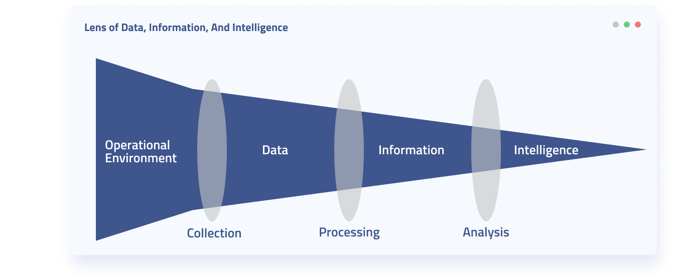
Data analysis comes at the tail end of the data lifecycle. Directly after or simultaneously performed with data integration (in which data from different sources are pulled into a unified view). Data analysis involves cleaning, modelling, inspecting and visualizing data.
The ultimate goal of data analysis is to provide useful data-driven insights for guiding organizational decisions. And without data analysis, you might as well not even collect data in the first place. Data analysis is the process of turning data into information, insight, or hopefully knowledge of a given domain.
Skip to
- Types of Data Analysis
- The Stages of High Quality Data Analysis
- What Can You Hope to Understand Through Data Analysis?
- The Largest Challenges of Data Analysis
- Data Analysis With Diffbot
Types of Data Analysis
Depending on your role and organization type, there are a range of types of data analysis you may perform.
- Data mining primarily deals with the discovery of knowledge for predictive purposes
- Business intelligence is more descriptive and often involves the aggregation of business-centered data sources
- Exploratory data analysis is used to explain the main characteristics and to surface new characteristics of a data set
- Confirmatory data analysis is used to confirm or invalidate hypotheses
- Predictive analytics focuses on forecasting or classification of data by statistical methods
- Text analytics utilizes many disciplines including AI, linguistics, and statistics to classify or structure unstructured data (such as web data)
While there can be substantial overlap between the above categories of data analysis, they can be useful to frame the types of data and analysis techniques that may be useful to your team.
These categories of data analysis also often occur at different stages within data analysis. One technique may point you to another type of analysis that may be fruitful in the future.
The Stages of High Quality Data Analysis
Though this varies depending on who you speak with, a generally agreed upon progression of the stages of data analysis includes the following:
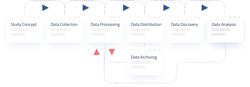
- Data Requirements are gathered as the initial stage of data analysis. These are the descriptors of the data that will be analyzed. In all likelihood data will be from several sources and it is often important to note whether you will need categorical or numerical data for the types of analysis you wish to conduct. At this stage it is also important to clarify what entity type you will be looking at. Are you looking at sessions for web users, individuals, organizations, demographic-defined groups, or so forth.
- Data Collection involves the actual gathering of information specified in data requirements. This stage may involve multiple teams as often IT members within an organization function as keepers of data, while analysts or others may define the requirements. Data collection may be quite involved or quick and painless as data can be obtained in many ways. For example, you may obtain all data needed from a quick API call. Or you may need to physically check sensors in the field, or conduct interviews, or combine many different data sources.
- Data Processing (also called “data integration”) may be lumped in with data cleaning. This stage essentially involves taking the raw data and pulling it into a uniform format so that individuals can ascertain what needs to be cleaned and perform additional analysis. For example, you may receive data in both csv and json format. A decision at this step would transform the data into tabular or hierarchical formats. A single view of data from multiple sources is often the output of this stage. An additional important aspect to consider at this stage is that of data provenance.
- Data Cleaning is often the most time consuming portion of data analysis. Data may be missing, erroneous, or inconsistently inputted. For large volumes of data, rather than seeking 100% clean data, many techniques rather look for the largest potential clusters of “fishy” data. This may be done by comparing values to other data sets in the same field that are thought to be reliable. Or by looking at the most extreme outliers in your data set and verifying that they are correct.
- Data Analysis is the stage at which data is actually analyzed. What occurs at this step will depend on the type of analysis your team wishes to perform.
- Exploratory data analysis may be iterative in nature, involving initial descriptions of features of a data set, followed by additional rounds of data cleaning or requests for additional data types.
- Statistical hypothesis testing and modelling seek to confirm or deny a hypothesis based on a data set. These techniques often use statistical inference to discern the probabilistic distribution that underlies a data set. Regression analysis measures the relationships between different variables. For example, did increased marketing spending actually relate to an increase in sales.
- Predictive analytics consists of a wide variety of techniques aimed at analyzing a past data set to model potential future or unknown outcomes.
- Textual analytics (also known as text mining) applies linguistic, natural language processing, structural, and statistical techniques to extract and classify information. This is often used when the data to be processed is unstructured as is the case with web data, pdfs, or other historical document types.
- Data Interpretation may also include the final stage of data visualization. This stage looks at the implications of the analysis and can go so far as to suggest courses of action or summarize key takeaways from the analysis process. Another important component of data interpretation involves
- Data Visualization (or more generally, data communication) relies on the fact that the human mind can much more quickly take in data and relationships in a visual way than in a purely textual manner. Data visualization or communication can involve a live feed of data, be tailored to present your findings, or present the data in an explorable fashion so that other stakeholders can come to their own conclusions about the data.
- Edward Tufte, in his classic 1983 book The Visual Display of Quantitative Information defines 9 best practices in data visualization that are surprisingly prescient to this day. They include:
- show the data
- induce the viewer to think about the substance rather than about methodology, graphic design, the technology of graphic production or something else
- avoid distorting what the data has to say
- present many numbers in a small space
- make large data sets coherent
- encourage the eye to compare different pieces of data
- reveal the data at several levels of detail, from a broad overview to the fine structure
- serve a reasonably clear purpose: description, exploration, tabulation or decoration
- be closely integrated with the statistical and verbal descriptions of a data set.
- Edward Tufte, in his classic 1983 book The Visual Display of Quantitative Information defines 9 best practices in data visualization that are surprisingly prescient to this day. They include:
What Can You Hope To Understand From Data Analysis?
The greatest value of a picture is when it forces us to notice what we never expected to see. – John Tukey
Gaining meaningful insights from data analysis for your organization depends on a number of factors. The following steps, roughly aligned with the data analysis progression listed above will all play a role in whether or not your data analysis efforts will be fruitful, reliable, and drive quality decision making.
- Did you choose the right data set(s)?
- Can your data sets effectively clarify your issues of concern?
- Are you approaching your data set in an initial exploratory way, or are you seeking to prove or disprove a specific point?
- Is your data set reliable?
- Can you realistically clean your data sets?
- How reliable are your data interpretations?
- How communicative is your data visualization or presentation?
Assuming you can answer the above questions in a satisfactory manner, there are many types of observations you can hope to gain through data analysis.
Some of the primary lenses that data can provide include:
Part-to-whole observations in which a whole is divided into categories and a ratio of part-to-whole is presented. Most commonly this type of observation takes the form of something like a pie chart.
Ranking observations in which entities are placed in numerical order based on weights given to specific values attached to these entities. For example, sales performance among a sales team could be calculated by looking at market saturation, market competition, new deals per sales team member, and value of these deals.
Time series observations compare some numeric value of one or more entities over time. Often in the form of line charts or stacked line charts for aggregation of different categories of whatever is being counted.
Deviation observations compare categories of entities against some form of reference. References are often in the form of an industry standard, an average across a domain, or a projection (ie a projected budget vs. actual budget).
Nominal comparison observations compare two categories of entities without regard for the order in which they’re displayed. You could use a nominal comparison observation to look at the numberr of employees working in the week versus on the weekend, or the size of a sales team next to their budget. Typically bar charts or dot charts are used for nominal comparisons.
Correlation observations present two variables and note whether they tend to track in the same or opposite directions for a given number of instances. For example, correlation observations in the form of a scatter plot could compare advertising costs and number of leads over time.
Geospatial observations plot variables across a geographic or spatial area. This could involve plotting variables against locations on a map or across floors of a building. Cartograms are common graphic types for this type of observation.
The Largest Challenges of Data Analysis
Errors using inadequate data are much less than those using no data at all. – Charles Babbage
Data analysis drives the most tangible value of any stage within the data lifecycle. It’s also the stage most prone to render even quality underlying data misleading, underutilized, or ineffective in decision making.
Additionally frustrating is the fact that for many data teams issues with other stages of their data lifecycle may not surface until the stage of analysis. This may lead to wasteful returns to earlier stages of data gathering, aggregation, processing, and so forth. The good news is that data lifecycles are iterative. And it’s much better to learn that you have issues with your data than it is to never realize this fact and provide ineffectual analysis.
Some of the largest challenges that can be surfaced by data analysis include:
Too Much, Or Too Little, Data
This may seem overly broad, but not having a realistic amount of data to analyze can render your analysis efforts ineffective. Having too much data occurs when your analysts or team can effectively wrangle the data. Sometimes thousands of interlinked data sets are sent to an analyst. Without proper data provenance, some schema overlap, or many data sets that need wrangling can lead to a tiny fraction of “available” data (or many sets with errors) in your analysis.
Too little data, on the other hand, is also an issue. While sometimes it’s all you have to go on, analysis of too little data may not be representative or statistically valid. There are times when data analysis is needed and there’s simply not enough data.
Tip: Best practices dictate you at least note the limitations of analysis with a smaller data set. When possible recommendations for other stages of the data lifecycle that could remedy a dearth of data are also good additions at this stage.
Data Misrepresented Visually
This is a particularly unfortunate error to have occurred, as all stages of a data lifecycle can come off without a hitch only to have your findings discredited due to a misleading visualization.
Common issues here may include “cherry picking” data points to expound upon visually, while ignoring equally important data points that contradict this claim; choosing the wrong timeline to show changes over time, as well as choosing the the wrong scale over which to show changes (minimizing or maximizing the visual change when unrepresentative).
Tip: data visualization helps you uncover what’s in data. Use data visualization to discover trends, then revisualize. Don’t start from a definite viewpoint and try to validate with data vis.
Integrating Data of Variable Quality
When valuable insights lurk at the intersection of multiple datasets, it’s important to make sure one of the data sets doesn’t invalidate findings from all linked sets. This can be particularly tricky when you’re mixing internal and external data sets.
Tip: exploratory data analysis can be taken with a “grain of salt.” Use initial analyses to point you in the direction you want to dive deeper (and with more scrutiny on your data sources).
Trouble Scaling Data Analytics
Data gathering and analysis efforts can begin organically in a small organization. Over time, as data sources, demands, and procedures grow, a host of issues can arrive. Most notably, building data analysis capabilities around one specific individual and then scaling up can lead to bottlenecks or an inability to continue analysis should that individual leave the organization. Additionally as more teams centralize their own data offerings, quality, formatting, or data preparation standards may vary greatly.
Tip: data glut is the norm these days. It’s important to plan for many cross functional data sources from the start and push for a culture of data quality.
You don’t know what data you have
While you can still perform quality data analysis even if you don’t know what data you have, you may very well be missing your most important data assets. Organizations that don’t inventory their data and have some notion of its value are setting themselves up for creating a failed data culture and underutilizing data.
Tip: you can’t effectively manage something you can’t quantify. Set up data inventorying procedures from the start of your data analysis projects.
You only use internal data
There are times when you’re the only party with the data you need. But many organizations have data gathering efforts that are too insular. Wide ranges of external data providers can augment marketing, ecommerce, news monitoring, contact, and a slew of other data types.
Tip: try to flesh out what your ideal data for analysis would include. Even if you don’t think it’s a possible set to achieve. At least consider external data providers and how they could meet your requirements.
Data Analysis With Diffbot
There are a number of ways Diffbot aids in boosting the efficacy of data analysis within many use cases.
First, Diffbot is an external data provider with arguably the best long tail organizational data coverage of any provider.
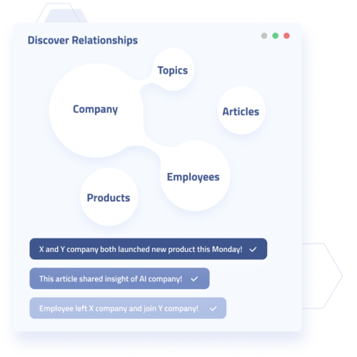
Diffbot primarily provides data via two services, automatic extraction APIs and our Knowledge Graph. Both employ AI and machine vision enabled web data extraction. This means you can gain automatically extracted and structured data from nearly any site online. As opposed to more traditional web scrapers that break on dynamic pages or web page changes, Diffbot’s AI adapts to provide ongoing accurate and comprehensive web-based information. Our AI additionally parses unstructured data from each web page type (product, article, discussion, etc.) into structured facts, allowing for a standard format for quality analysis.
While Diffbot’s Automatic Extraction APIs can be pointed at any domain to retrieve structured, analyzable data, the Knowledge Graph works by continuously pointing similar APIs at pages across the web. This provides a huge collection of entities and facts. Combined, these two web data extraction methods can drastically bolster data on long tale or international organizations that are hard to track.
Diffbot provides “origins” for every fact in its Knowledge Graph.
You can analayze any data you want, but understanding how verifiable each data point is through proper data provenance and lineage tracking is important to ensure your findings are valid. Diffbot differs from almost every other major web data provider in that each fact incorporated in our Knowledge Graph comes with an average of 5 citations. These locations point to where our AI first inferred the fact and can be verified.
Even though you may be dealing with data at scale from Diffbot, you don’t have to sacrifice knowing EXACTLY where you data comes from.
Integrations and the Knowledge Graph Dashboard are great for exploratory analysis.
Exploratory analysis within a spreadsheet is something nearly every knowledge worker can relate to. And one of the largest challenges to this sort of “informal” data analysis is not wasting all day gathering and formatting data, as well as ensuring that all of your data is of commensurate quality. Diffbot’s Knowledge Graph and Enhance integrations within Google Sheets and Excel alleviate the need to gather data about millions of organizations, people, and article topics. Follow any promising entity into the Knowledge Graph dashboard to visually mine into people, organizations, articles, discussions, products or more (all pre-parsed and linked with one another by our awesome web reading bot)!
Structured web data allows you to pull in the world’s largest source of data like never before.
Many organizations make the mistake of only looking to analyze their own data. External data sources can help to validate trends, enrich understanding about key entities, and keep your finger “on the pulse” at a global scale. Diffbot’s external web data offerings truly turn the web into a queryable database. Wondering how your data analysis could level up using Diffbot’s knowledge-as-a-service(s)? Be sure to check out our 14-day free trial, or contact sales for a demo.
You must be logged in to post a comment.