Skip Ahead
Total addressable market (TAM) is the — hopefully — large figure that represents potential revenue for a given product or service. These figures are useful for fundraising, assessing market saturation, and the prioritization of opportunities.
In our recently published guide to writing a market intelligence report with the Knowledge Graph we worked through creating a report for a fictitious Acme Energy. Acme Energy provides backup energy services and energy disruption mitigation for hospitals. In this guide we’ll work through finding and visualizing three useful TAM-related datasets with Diffbot’s Knowledge Graph.
In particular, we’ll look at how you can quickly surface the datasets needed for the following three visualizations:
")
")
")
Prerequisites
- Access to Diffbot’s Knowledge Graph (find a free two week trial here)
- Google Sheets (or equivalent spreadsheet software)
- I’ll use Infogram to visualize the data. Feel free to use any charting tool with mapping capabilities.
Step One: Define Service Set
There are three ways to calculate TAM, one of the most straightforward (if you have existing products or services) is as follows:
- (# of potential customers) x (annual contract value)
In our case let’s look at a hypothetical in which Acme Energy sells two service sets.
- $5,000 ACV deals to hospitals with less than 500 employees
- $100,000 ACV deals to hospitals with greater than 500 employees
Because we have two distinct sets of customers here, we’ll need to calculate both TAMs separately and add them together. In particular, we’ll need to calculate the following:
- (# of hospitals with less than 500 employees) x $5,000
- (# of hospitals with more than 500 employees) x $100,000
In the next step we’ll find our figures for the first portion of these formulas.
Step Two: Calculate Total Addressable Market
In Diffbot’s Knowledge Graph we can query for organizations based on specific firmographics. Both industries and number of employees are attached to organizations, which makes it easy to return the number of hospitals needed for our calculation. Below I’ll show two routes to obtaining your data. The first will utilize the visual query builder, which allows you to craft basic search queries in a beginner-friendly way. The second involves using Diffbot Query Language (DQL), which is slightly more involved, but allows for greater control over your query. New to using DQL? Start by simply pasting in the queries typed out below or check out our DQL Quick Start guide.
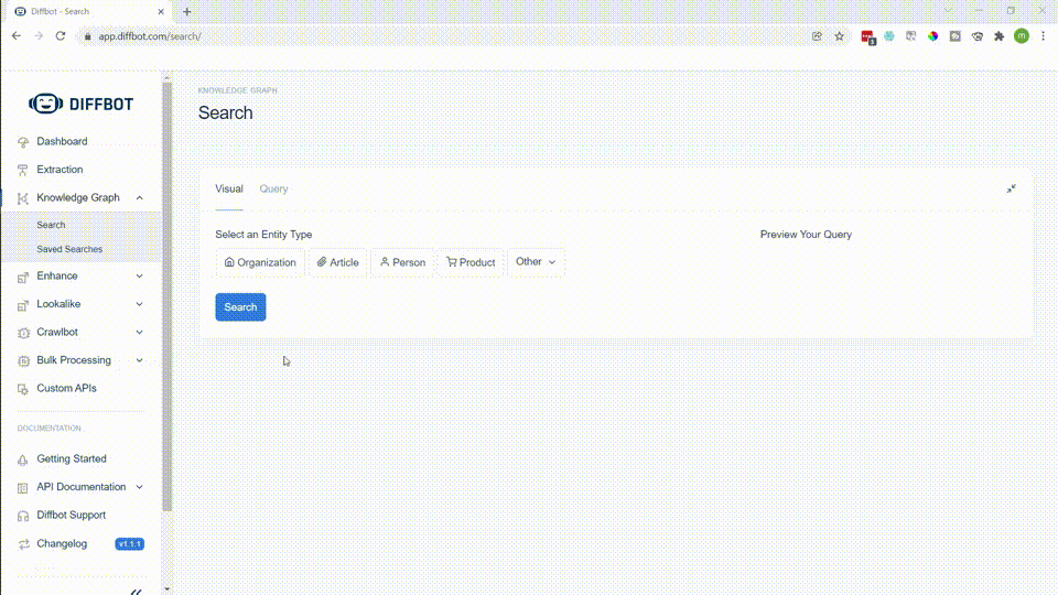
Using the Visual Query Builder
We can form an initial hospital query using a few fields: industries, nbEmployees, and location. Start by choosing the type of entity you want returned (organization). Then simply toggle the location to United States, the industry name to hospitals, and the nbEmployees to <=500.
One quick query returns over 100,000 results! To obtain the second group of hospitals (with greater than 500 employees), simply alter the nbEmployees field. Also of note to the right of the screen is the preview of your query. This shows you the DQL version of your query and is a great way to start familiarizing yourself with what this query language looks like.
Using Diffbot Query Language
While this visual query is a great starting point, this particular data set could use some more work. As I looked through the returned organizations I saw some veterinary hospitals, optometric clinics, and home health businesses returned. While these may in some senses be “hospitals,” they aren’t what we’re looking for here. This is an instance in which DQL comes in handy.
The eventual query I settled on specifies that we don’t want organizations who are in sometimes related industries to hospitals, and that “hospital” should be in the name of the organization returned. This seemed to provide the most reliable dataset.
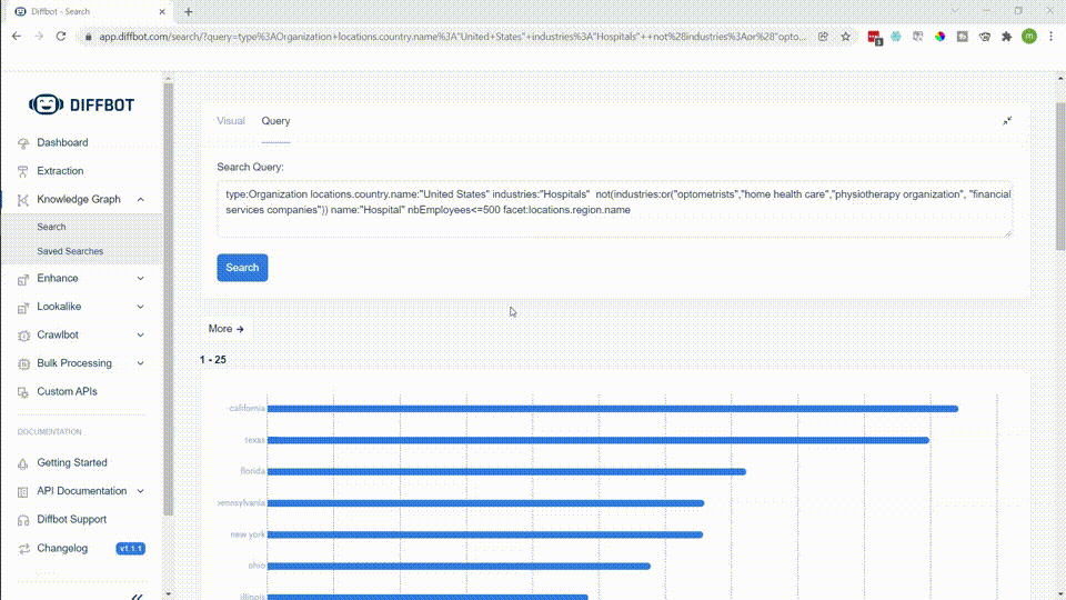
type:Organization locations.country.name:"United States" industries:"Hospitals" not(industries:or("optometrists","home health care","physiotherapy organization", "financial services companies")) name:"Hospital" nbEmployees>=500
This query returns 1,244 results, the number of large hospitals for one half of our TAM equation. By changing the nbEmployees to nbEmployees<=500 we can find our other number. Plugged into the equation this means that our TAM is as follows.
- (1,244 x $100,000) + (11,151 x $5,000) = $180,155,000
While we could export all of this data, using DQL enables facet queries, which are a useful way to quickly summarize the results of a specific field. In this case we can use this to return a summary of which states provide the most TAM.
type:Organization locations.country.name:"United States" industries:"Hospitals" not(industries:or("optometrists","home health care","physiotherapy organization", "financial services companies")) name:"Hospital" nbEmployees<=500 facet:locations.region.name

To obtain the complete dataset we'll yet again need to alter the nbEmployees field and then download the results. I ended up pulling both datasets into the same spreadsheet to perform the simple TAM arithmetic to all states at once.
After converting the number of large and small hospitals per state into state-by-state TAM, we can analyze the data as we wish. In my case I pulled the numbers into a data visualization tool to see which regions have the largest opportunities.
What we've done here is quickly survey the number of hospitals by location and size across the United States. This search wouldn't have been possible in consumer search engines. And it's a good starting point. But the general trend above is still similar to a population density map. Perhaps there's more we can do to surface where opportunity lies for our fictitious Acme Energy.
Step Three: Analyze Competitors
In case our initial query of small hospitals didn't show this to be the case, the Knowledge Graph excels at long tail (SMB and MMKT) information. We have over 250M organizations in total, with solid coverage worldwide and across many, many industries.
To show this at work, let's surface a dataset of Acme Energy's competitors and plot it on a similar map to our TAM by state graphic.
Using the Visual Query Builder
After several exploratory queries, the query that yielded the best results for competitors for Acme Energy relied on the description field. This field is a few sentence summary of what an organization does. While we can look at energy companies from an industry level, this is a much more general query. What we're after here are American companies who provide services related to backup power.

Our visual query builder results return 327 backup energy providers across the United States. Clicking through some of the organization's profiles, they offer the precise service set of Acme Energy. The only downside to using the visual query builder is that there is not presently the ability to facet (provide a summary view). This means that you would need to export the data to csv and do a small bit of data wrangling to determine the number of competitors by state.
Using Diffbot Query Language
With Diffbot Query Language we can use the same query as we generated with the visual query builder and simply add a facet statement to the end (similarly to how we faceted to gain TAM by state).
type:Organization description:"backup power" location.country.name:"United States" facet:locations.region.name
After exporting our facet view, we can move straight to visualization or analysis.
Step Four: Analyze Competitors By TAM
While our competitors map largely also follows population density (with the exception of New York), with some simple arithmetic we can gain an even clearer view of where opportunity may lie.
Using our datasets for TAM by state and competitors by state, we can simply divide the two to provide a general view of how much unclaimed market there is.
Loading the resulting data into the same format provides the following visualization:
While state-by-state location may not matter for some industries (say, SAAS), many market intelligence analyses go to great depth to obtain state-by-state data. In this case we've surfaced relative opportunity in North Dakota and Iowa that wasn't present in our initial data set.
Our Knowledge Graph is based on web-wide crawls that update our organization database every few days. Want to see what coverage is like for your industry? Try out a free two-week trial or contact sales for a customized demo!
You must be logged in to post a comment.